Real-app findings

45 findings nobody
planted.

Caraxe reviewed 27 published Android apps it had never seen, with no answer sheet and nothing hidden for it to find. Every finding below survived an independent adversarial check, and the strongest were re-tested on a physical device running the same build.

The review removed our own headline. A crash we had reported as the most serious finding here did not happen again in ten attempts on the same build, and no crash record was ever written, so it was withdrawn rather than published with a caveat. Every finding this gallery once called critical is gone the same way. That is the honest result and not the one we set out to publish.
What happened to the rest. The review raised 75 candidate findings. 45 are published here. 14 were withdrawn as refuted by their own evidence or by a device re-test. 14 are held: not refuted, but not settled from stored artifacts either, so they wait for a device. 2 were raised against apps the review never actually opened. Held is not the same as wrong - most are probably fine - but “probably fine” is not what this page says about what it prints.
What the screenshots are. Each one shows the screen the finding was raised on. They do not highlight the specific element. Where a finding counts controls, that count was recomputed independently from the interface tree the detector measured.
org.fossify.filemanager · version 2026-04-19_13

Fossify Filemanager

5 findings published.

Accessibility · warning
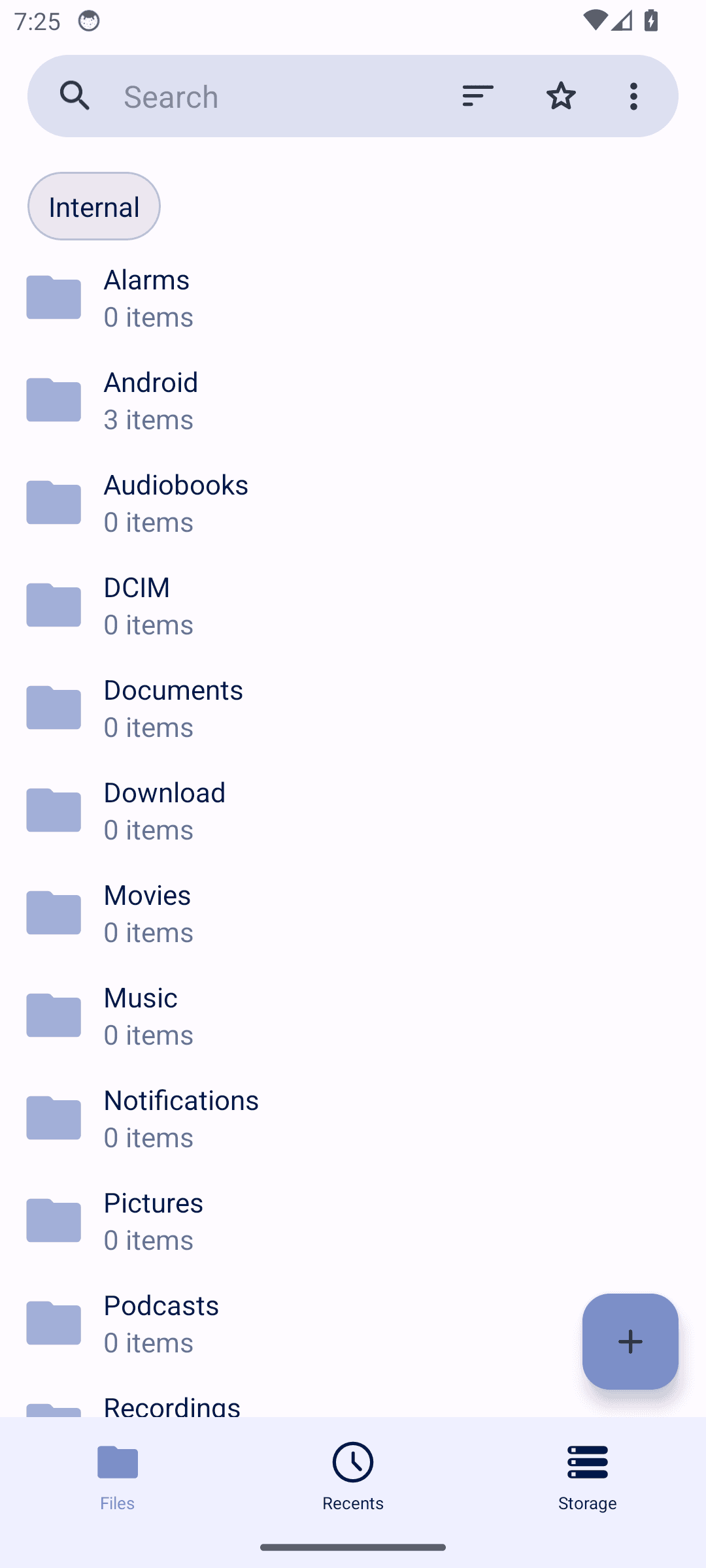
Controls a screen reader cannot announce

Controls have nothing for a screen reader to announce. A blind user hears "button" with no indication of what it does, so the screen cannot be operated without sight.

Fossify Filemanager: Controls a screen reader cannot announce

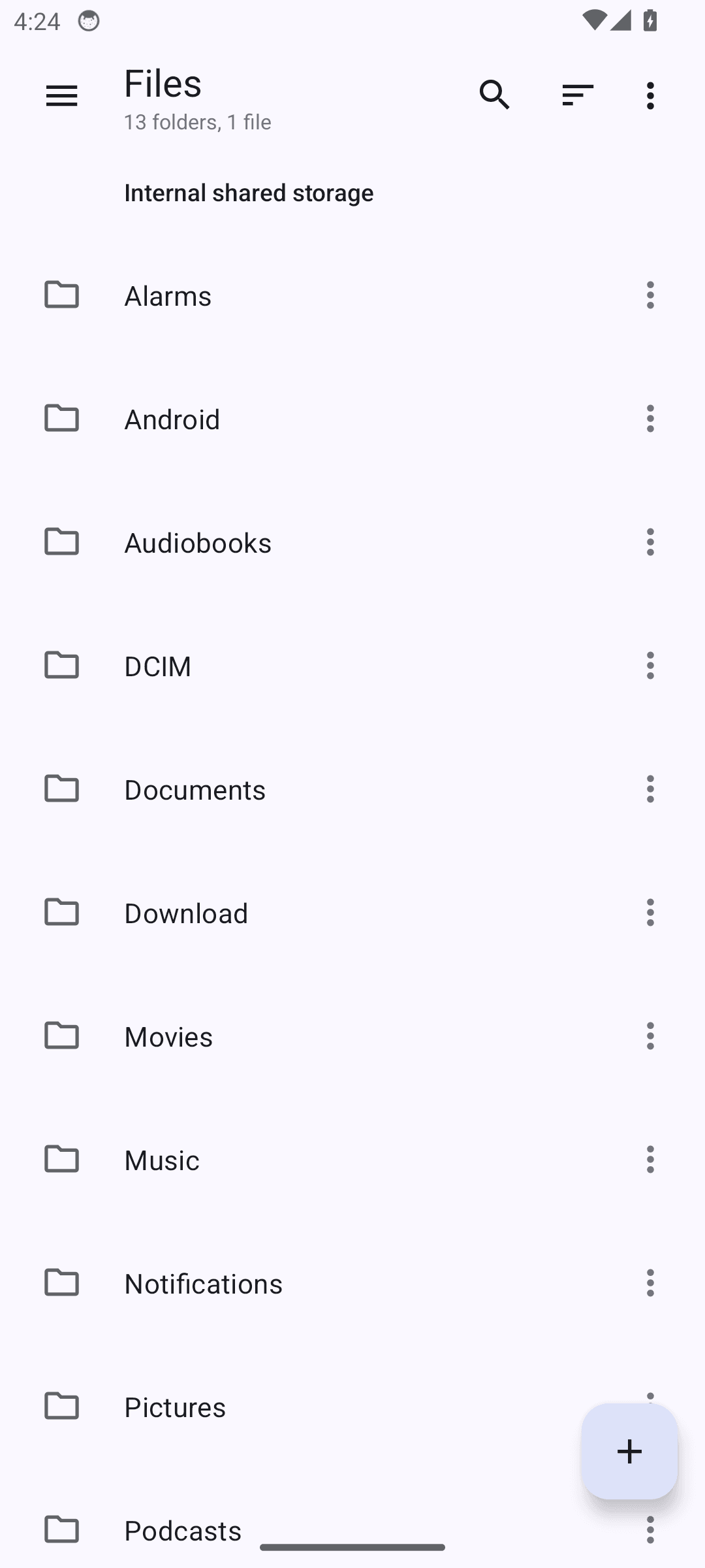
1 clickable control(s) on this screen have no visible text or accessibility label. Examples: org.fossify.filemanager:id/items_fab.

Measured against. WCAG 2.2 SC 1.1.1 Non-text Content and SC 4.1.2 Name, Role, Value
Accessibility · warning

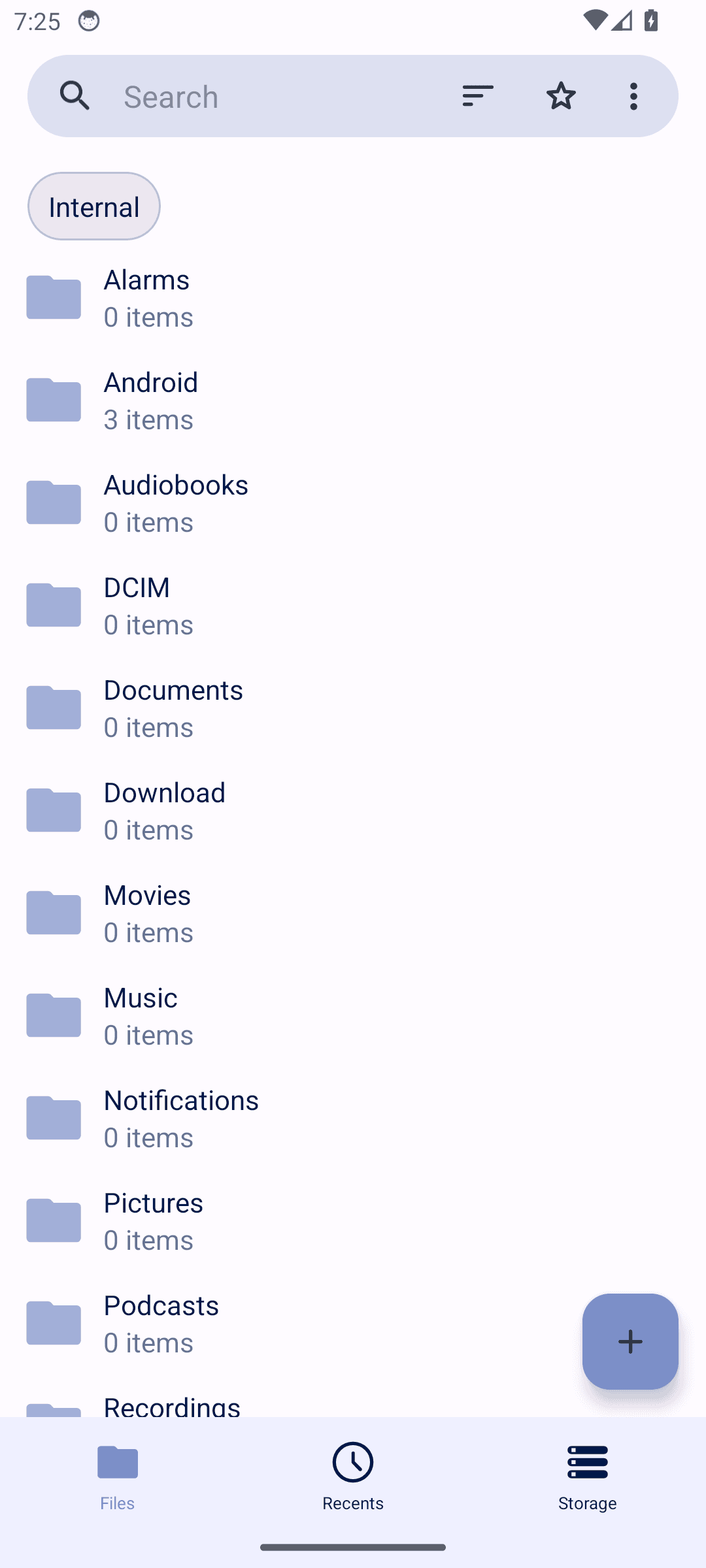
Controls are too small to tap reliably

Controls are too small to hit reliably. People with larger fingers, limited dexterity, or a moving bus mistap them, and each mistap is either a wrong action or a retry.

Fossify Filemanager: Controls are too small to tap reliably

2 interactive element(s) on this screen fall below Android's 48x48dp touch target guidance. Examples: Internal, org.fossify.filemanager:id/item_frame.

Measured against. Android accessibility guideline – 48x48dp minimum touch target (WCAG 2.2 SC 2.5.8, Target Size)

Usability · warning

Bottom navigation bar overlaps last list item

Parts of the screen sit on top of each other, so something the app meant to show is covered up. Whatever is hidden might be the thing the person came for.

Fossify Filemanager: Bottom navigation bar overlaps last list item

The last visible folder item ('Recordings') is partially obscured by the bottom navigation bar, indicating the list content does not have adequate bottom padding/inset to account for the nav bar height.

Suggested fix. Add bottom padding to the folder list equal to the height of the bottom navigation bar so the last item is fully visible when scrolled to the end.

Usability · warning

Floating action button overlaps list content

Parts of the screen sit on top of each other, so something the app meant to show is covered up. Whatever is hidden might be the thing the person came for.

Fossify Filemanager: Floating action button overlaps list content

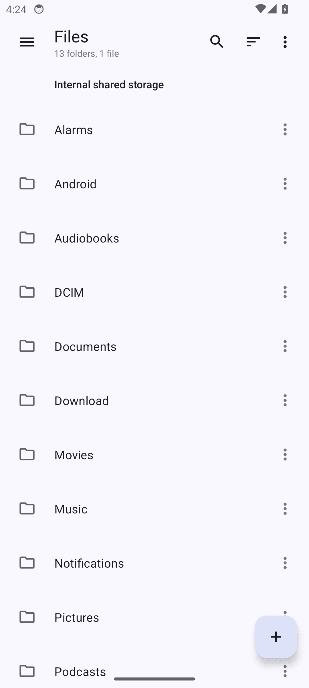
The '+' FAB is positioned directly over the 'Podcasts' folder row, partially covering its item count text, which can make the underlying content hard to read or tap accurately.

Suggested fix. Ensure sufficient list padding at the bottom so the FAB does not visually overlap the last few list items, or add a scrim/spacing behind the FAB.

Confirmed on a device. Re-checked on live hardware, on the same build. FAB (891,1980)-(1038,2127) covers the Podcasts row by 136x57px and its item count by 136x29px.

Usability · warning

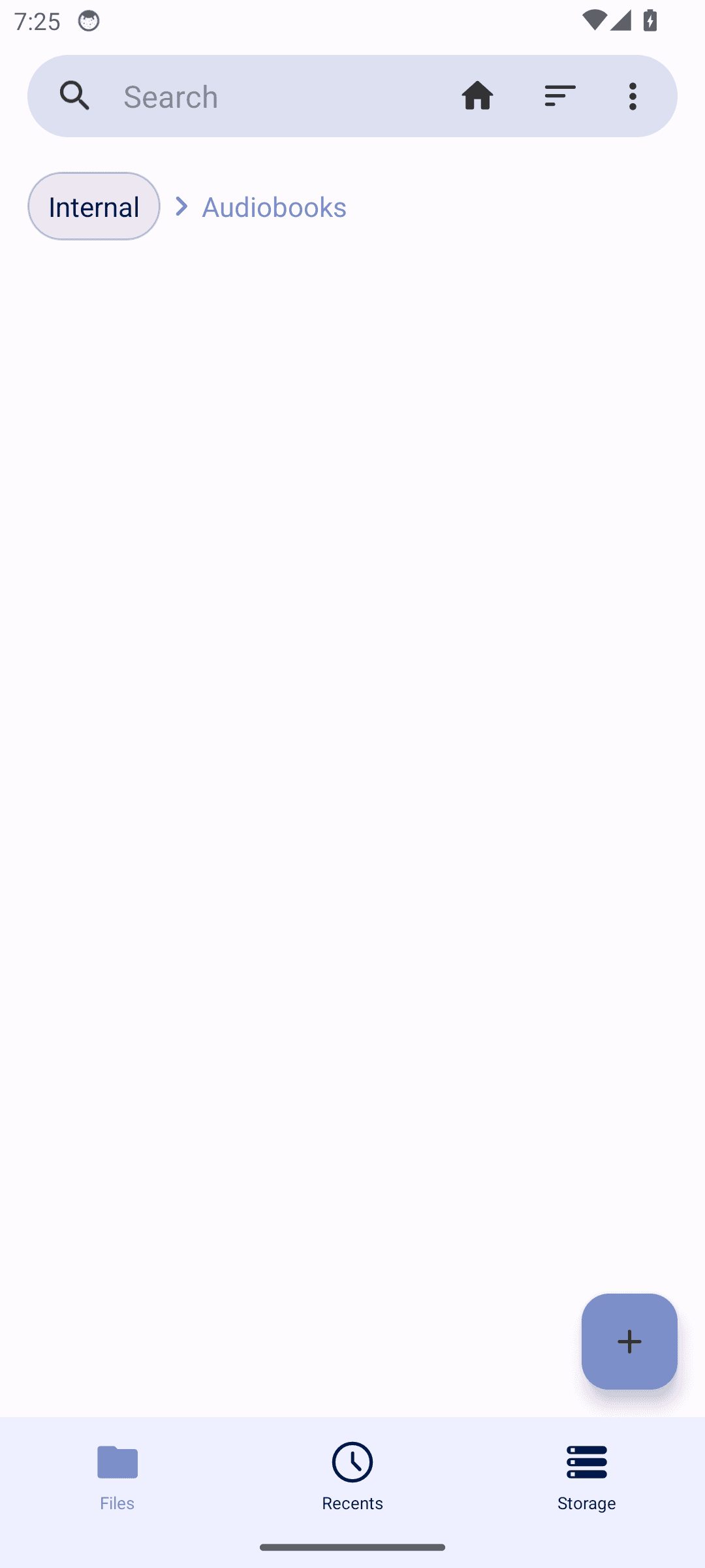
No empty state message in empty folder

The app works here, but the way it presents itself makes people hesitate or guess. Nobody files a bug about this; they just use the feature less.

Fossify Filemanager: No empty state message in empty folder

When navigating into the empty 'Audiobooks' folder, the screen shows a blank white area with no indication that the folder is empty. Users may think the app is still loading or broken.

Suggested fix. Add an empty-state illustration or text such as 'This folder is empty' when a folder contains no items.

org.fossify.gallery · version 2026-04-19_28

Fossify Gallery

4 findings published.

Accessibility · warning

Controls a screen reader cannot announce

Controls have nothing for a screen reader to announce. A blind user hears "button" with no indication of what it does, so the screen cannot be operated without sight.

Fossify Gallery: Controls a screen reader cannot announce

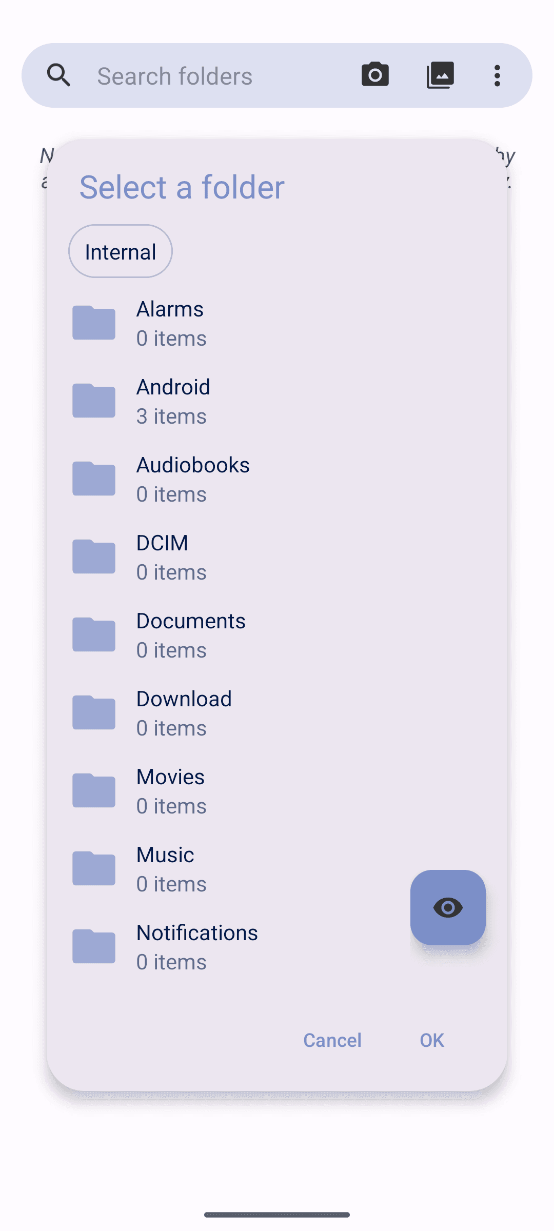
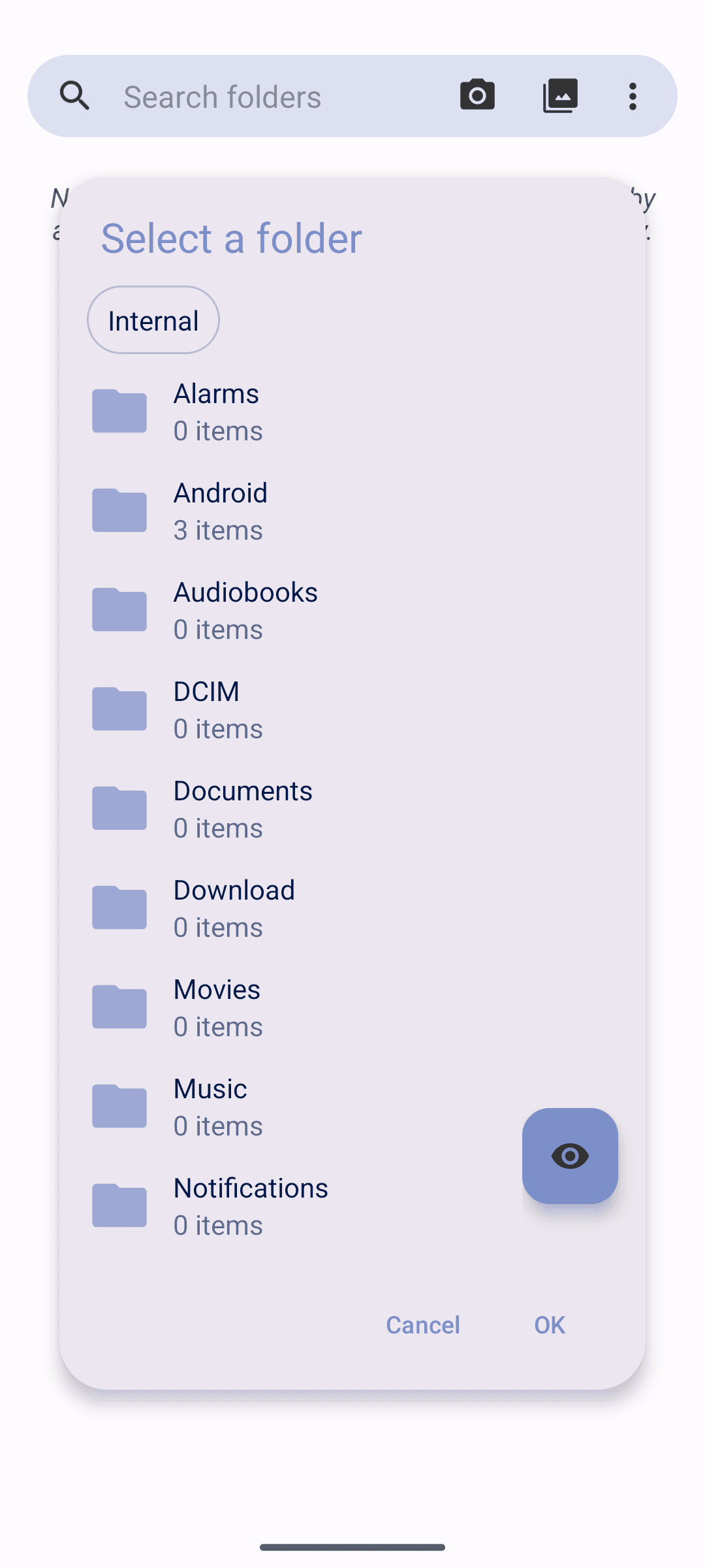
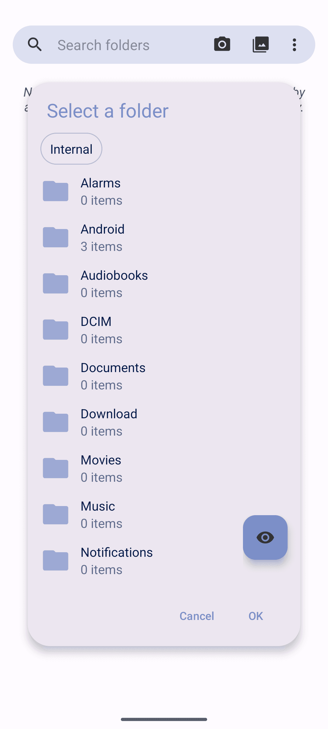
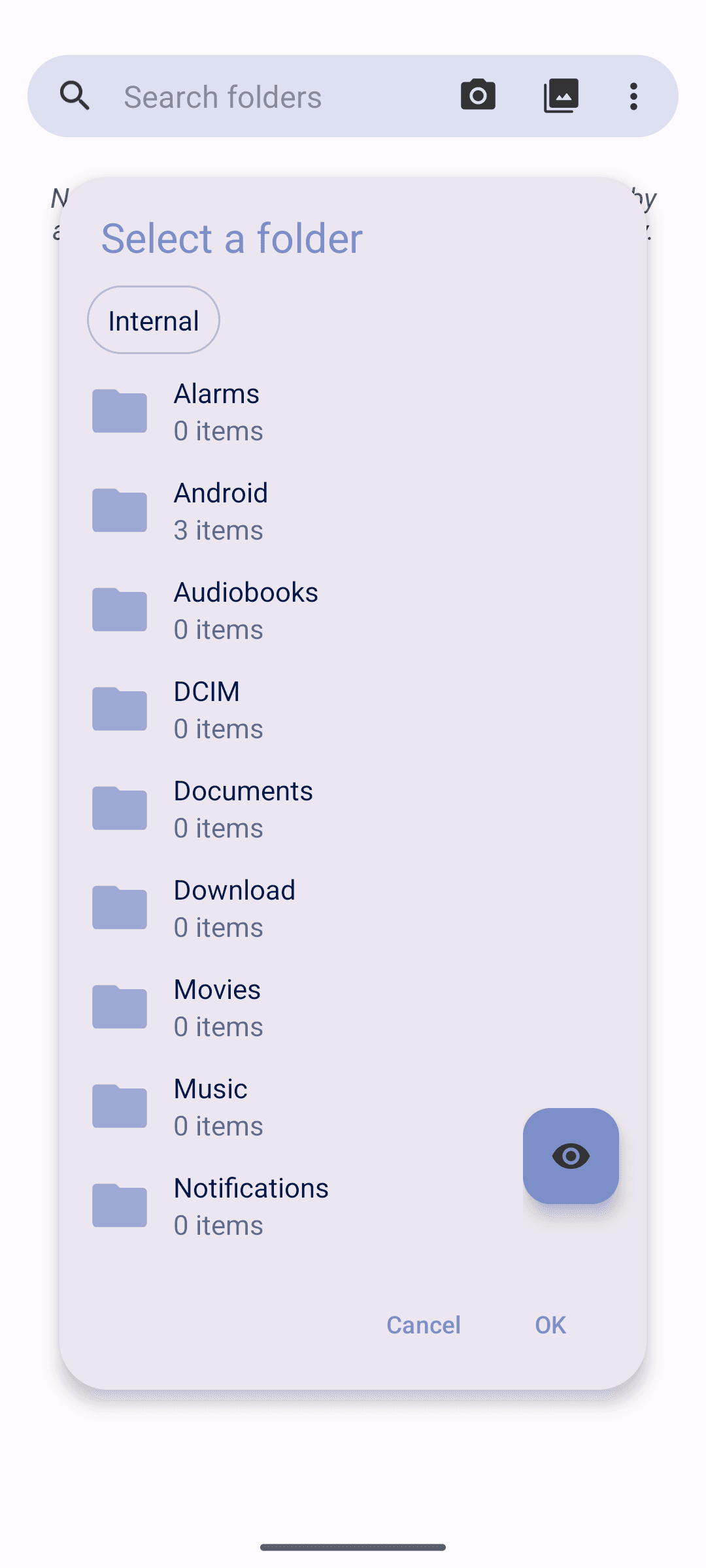
1 clickable control(s) on this screen have no visible text or accessibility label. Examples: org.fossify.gallery:id/filepicker_fab_sh.

Measured against. WCAG 2.2 SC 1.1.1 Non-text Content and SC 4.1.2 Name, Role, Value
Accessibility · warning

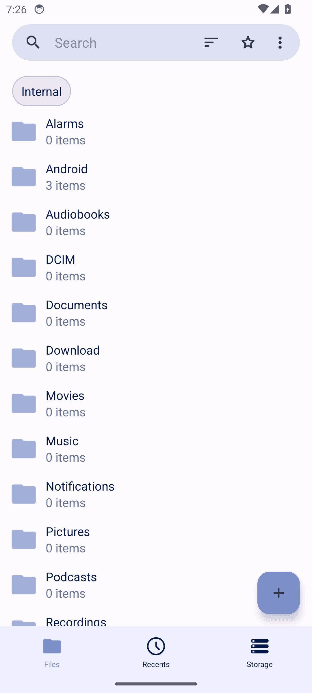
Controls are too small to tap reliably

Controls are too small to hit reliably. People with larger fingers, limited dexterity, or a moving bus mistap them, and each mistap is either a wrong action or a retry.

Fossify Gallery: Controls are too small to tap reliably

2 interactive element(s) on this screen fall below Android's 48x48dp touch target guidance. Examples: Internal, org.fossify.gallery:id/list_item_holder.

Measured against. Android accessibility guideline – 48x48dp minimum touch target (WCAG 2.2 SC 2.5.8, Target Size)

Accessibility · warning

Icon-only floating button lacks visible label

Something on this screen cannot be used by someone relying on a screen reader, a larger font, or steady aim. That group cannot work around it, so for them the screen is simply unavailable.

Fossify Gallery: Icon-only floating button lacks visible label

The eye-shaped floating button in the folder picker has no visible text label, and it's unclear from the screen what action it performs (e.g., toggle hidden folders), which may confuse users and screen reader users if it lacks a content description.

Suggested fix. Add a content description for accessibility services and consider a tooltip or label clarifying the button's purpose (e.g., 'Show hidden folders').

Usability · warning

Floating visibility toggle button overlaps folder list item

The app works here, but the way it presents itself makes people hesitate or guess. Nobody files a bug about this; they just use the feature less.

Fossify Gallery: Floating visibility toggle button overlaps folder list item

The circular eye/visibility icon button in the folder selection dialog is positioned over the 'Notifications' folder row, partially obscuring its text and item count, and likely intercepting touch input intended for that list item.

Suggested fix. Reposition the floating action button so it does not overlap list content, or add padding/margin to the list to reserve space for the button.

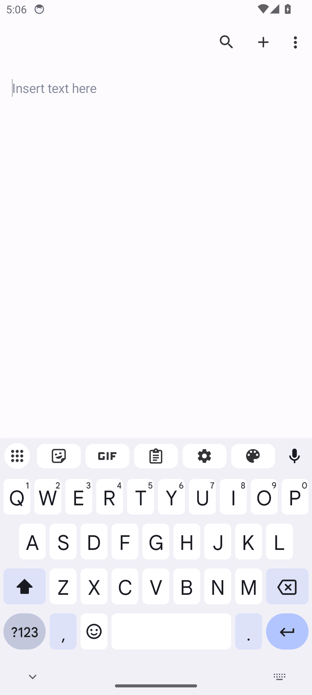
net.gsantner.markor · version 2026-04-19

Markor

3 findings published.

Accessibility · warning

Controls a screen reader cannot announce

Controls have nothing for a screen reader to announce. A blind user hears "button" with no indication of what it does, so the screen cannot be operated without sight.

Markor: Controls a screen reader cannot announce

1 clickable control(s) on this screen have no visible text or accessibility label. Examples: image.

Measured against. WCAG 2.2 SC 1.1.1 Non-text Content and SC 4.1.2 Name, Role, Value

Accessibility · suggestion

Controls are too small to tap reliably

Controls are too small to hit reliably. People with larger fingers, limited dexterity, or a moving bus mistap them, and each mistap is either a wrong action or a retry.

Markor: Controls are too small to tap reliably

2 interactive element(s) on this screen fall below Android's 48x48dp touch target guidance. Examples: Go to, More options.

Measured against. Android accessibility guideline – 48x48dp minimum touch target (WCAG 2.2 SC 2.5.8, Target Size)

Usability · warning

Small, tightly packed formatting toolbar icons

The app works here, but the way it presents itself makes people hesitate or guess. Nobody files a bug about this; they just use the feature less.

Markor: Small, tightly packed formatting toolbar icons

The bottom formatting toolbar in the markdown editor (list, undo, clock, keyboard, bullet list, bold, H2, H1) contains many icons packed closely together with minimal spacing, making them harder to tap accurately, especially for users with larger fingers or motor impairments.

Suggested fix. Increase spacing between toolbar icons or increase individual touch target size to meet the recommended minimum of 48x48dp.

Confirmed on a device. Re-checked on live hardware, on the same build. Formatting icons 43-44x40dp, one at 17x40dp, 44dp pitch.

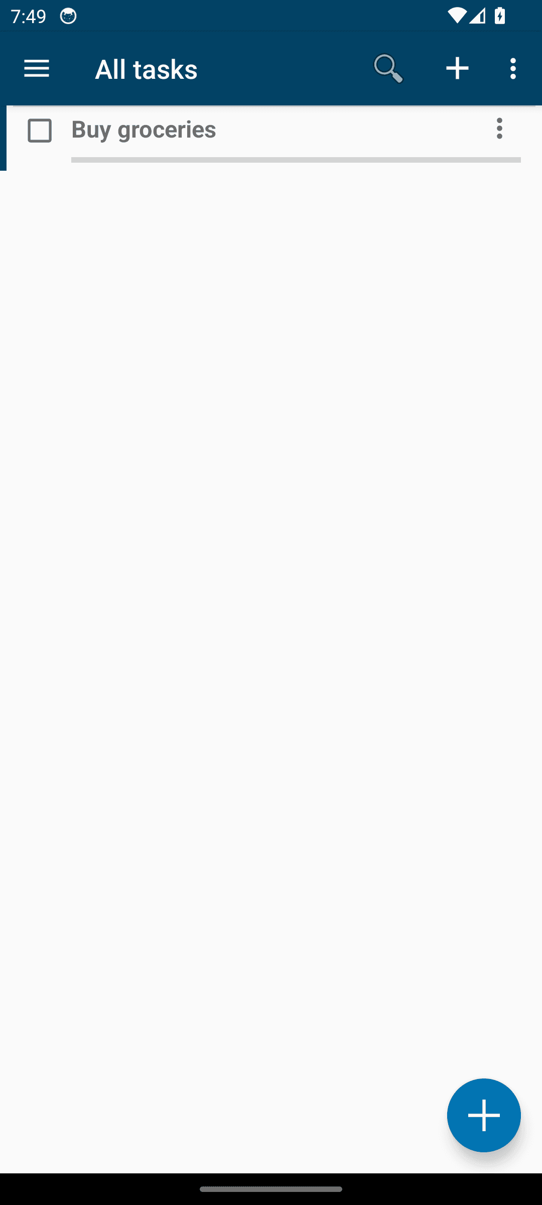
org.tasks · version 2026-04-19_150204

Tasks Org

3 findings published.

Accessibility · warning

Controls a screen reader cannot announce

Controls have nothing for a screen reader to announce. A blind user hears "button" with no indication of what it does, so the screen cannot be operated without sight.

Tasks Org: Controls a screen reader cannot announce

1 clickable control(s) on this screen have no visible text or accessibility label. Examples: button.

Measured against. WCAG 2.2 SC 1.1.1 Non-text Content and SC 4.1.2 Name, Role, Value
Confirmed on a device. Re-checked on live hardware, on the same build. Exactly 1 unlabelled clickable (ImageButton 56x80dp) - count and example type match.

Accessibility · suggestion

Controls are too small to tap reliably

Controls are too small to hit reliably. People with larger fingers, limited dexterity, or a moving bus mistap them, and each mistap is either a wrong action or a retry.

Tasks Org: Controls are too small to tap reliably

1 interactive element(s) on this screen fall below Android's 48x48dp touch target guidance. Examples: More options.

Measured against. Android accessibility guideline – 48x48dp minimum touch target (WCAG 2.2 SC 2.5.8, Target Size)

Confirmed on a device. Re-checked on live hardware, on the same build. More options = 40x48dp - cited example and count match exactly.

Usability · warning

Save icon has low visual prominence

The app works here, but the way it presents itself makes people hesitate or guess. Nobody files a bug about this; they just use the feature less.

Tasks Org: Save icon has low visual prominence

The save action (top-left floppy disk icon) on the task edit screen is a small monochrome icon with no label, making the primary save action easy to miss compared to a more prominent labeled button.

Suggested fix. Consider adding a text label or increasing visual weight (e.g., color or size) for the save action to improve discoverability.

Confirmed on a device. Re-checked on live hardware, on the same build. 24x24dp monochrome glyph, no label, sole save affordance on the edit screen.

com.ichi2.anki · version 2026-04-19_22303300

Ankidroid

2 findings published.

Accessibility · warning

Controls a screen reader cannot announce

Controls have nothing for a screen reader to announce. A blind user hears "button" with no indication of what it does, so the screen cannot be operated without sight.

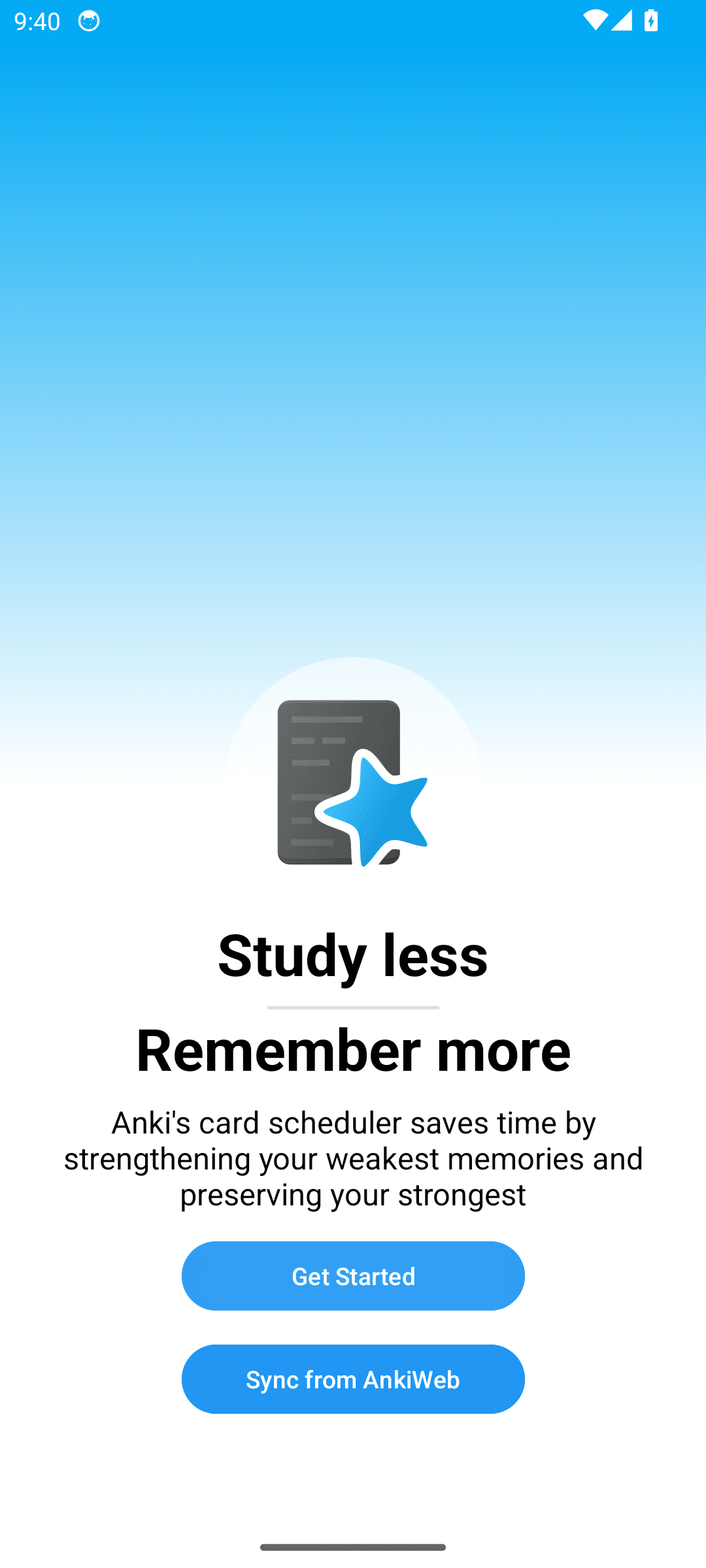
Ankidroid: Controls a screen reader cannot announce

2 clickable control(s) on this screen have no visible text or accessibility label. Examples: com.ichi2.anki:id/button, com.ichi2.anki:id/fab_main.

Measured against. WCAG 2.2 SC 1.1.1 Non-text Content and SC 4.1.2 Name, Role, Value
Accessibility · suggestion

Controls are too small to tap reliably

Controls are too small to hit reliably. People with larger fingers, limited dexterity, or a moving bus mistap them, and each mistap is either a wrong action or a retry.

Ankidroid: Controls are too small to tap reliably

1 interactive element(s) on this screen fall below Android's 48x48dp touch target guidance. Examples: More options.

Measured against. Android accessibility guideline – 48x48dp minimum touch target (WCAG 2.2 SC 2.5.8, Target Size)

org.fdroid.fdroid · version 1.23.2

Fdroid

2 findings published.

Accessibility · warning

Controls a screen reader cannot announce

Controls have nothing for a screen reader to announce. A blind user hears "button" with no indication of what it does, so the screen cannot be operated without sight.

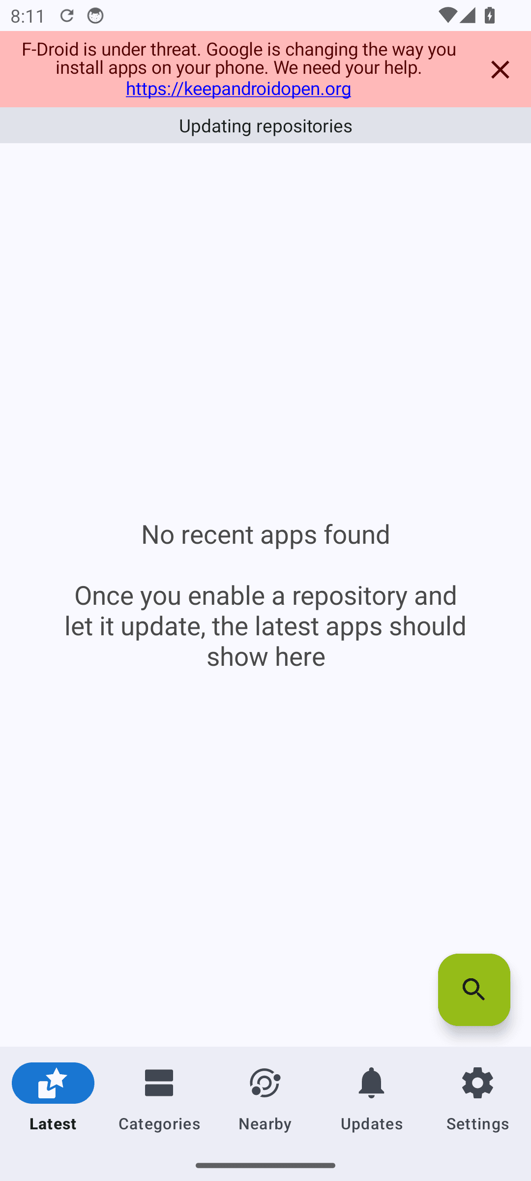
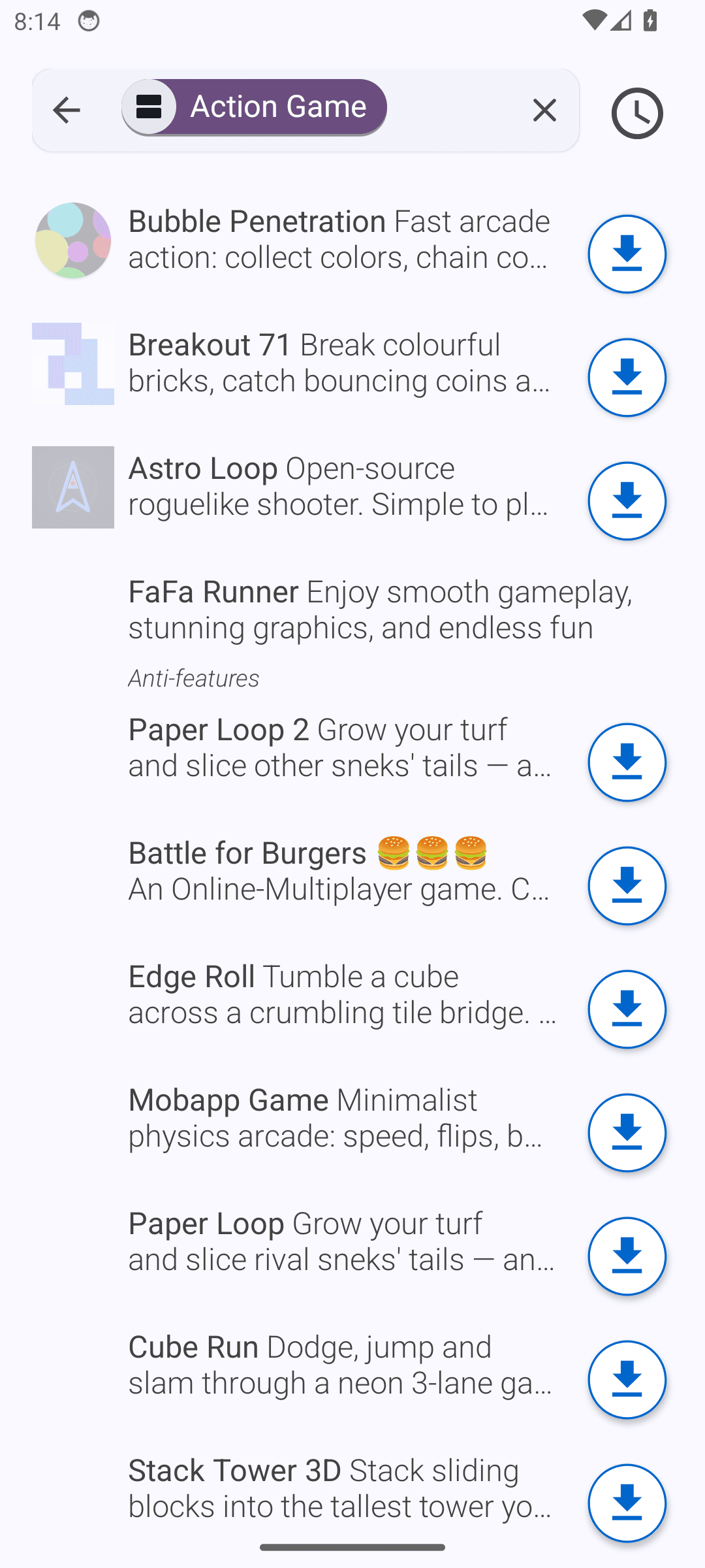
Fdroid: Controls a screen reader cannot announce

1 clickable control(s) on this screen have no visible text or accessibility label. Examples: button.

Measured against. WCAG 2.2 SC 1.1.1 Non-text Content and SC 4.1.2 Name, Role, Value
Accessibility · warning

Controls are too small to tap reliably

Controls are too small to hit reliably. People with larger fingers, limited dexterity, or a moving bus mistap them, and each mistap is either a wrong action or a retry.

Fdroid: Controls are too small to tap reliably

1 interactive element(s) on this screen fall below Android's 48x48dp touch target guidance. Examples: container.

Measured against. Android accessibility guideline – 48x48dp minimum touch target (WCAG 2.2 SC 2.5.8, Target Size)

com.nononsenseapps.feeder · version 2026-04-19

Feeder

2 findings published.

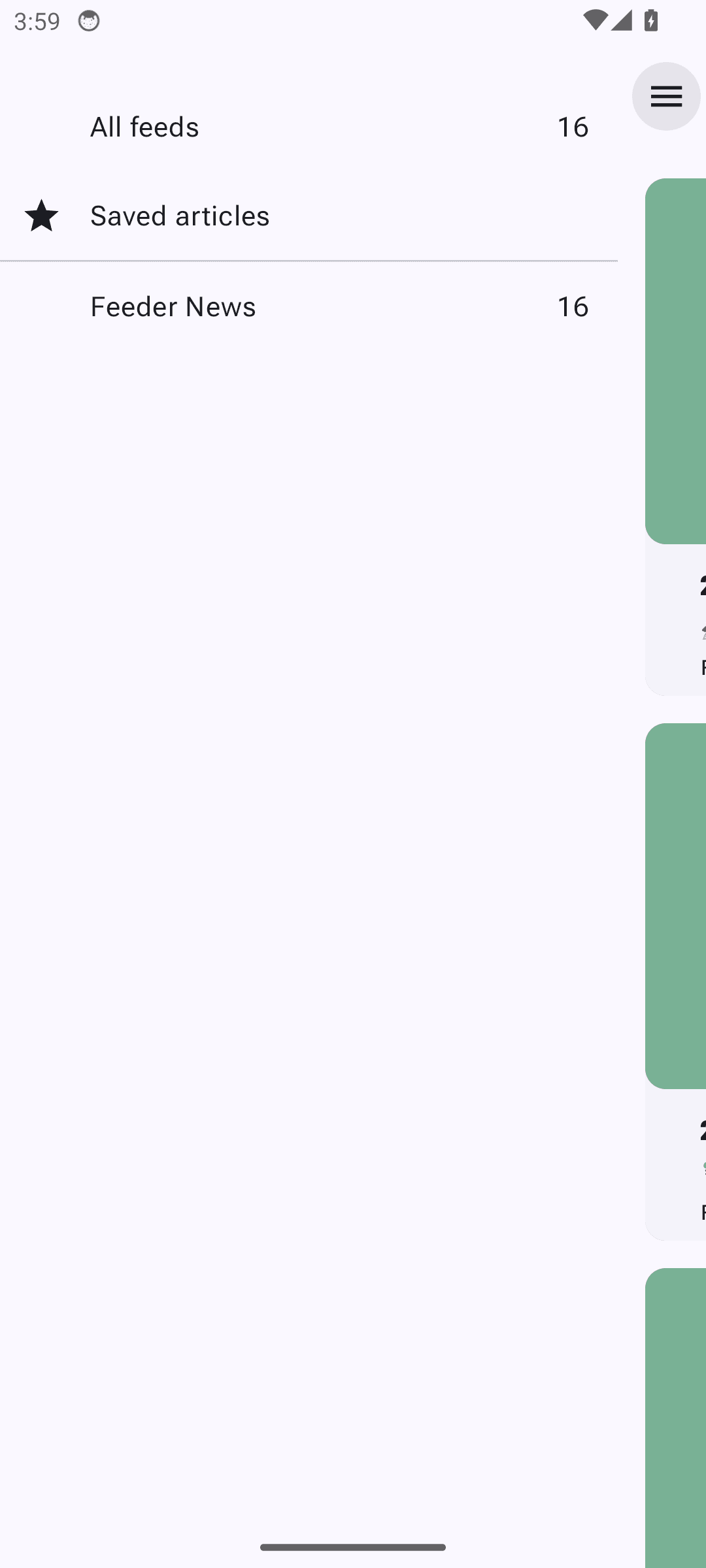
Accessibility · warning

Controls a screen reader cannot announce

Controls have nothing for a screen reader to announce. A blind user hears "button" with no indication of what it does, so the screen cannot be operated without sight.

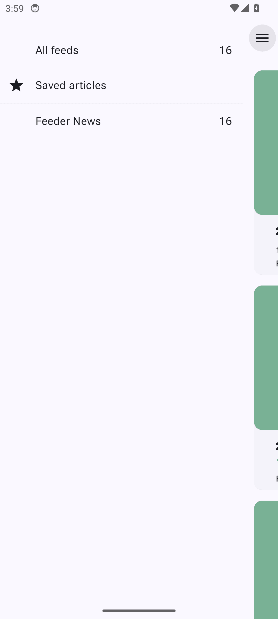
Feeder: Controls a screen reader cannot announce

1 clickable control(s) on this screen have no visible text or accessibility label. Examples: container.

Measured against. WCAG 2.2 SC 1.1.1 Non-text Content and SC 4.1.2 Name, Role, Value
Accessibility · warning

Controls are too small to tap reliably

Controls are too small to hit reliably. People with larger fingers, limited dexterity, or a moving bus mistap them, and each mistap is either a wrong action or a retry.

Feeder: Controls are too small to tap reliably

4 interactive element(s) on this screen fall below Android's 48x48dp touch target guidance. Examples: container, container, container.

Measured against. Android accessibility guideline – 48x48dp minimum touch target (WCAG 2.2 SC 2.5.8, Target Size)

org.fossify.calendar · version 2026-04-19_20

Fossify Calendar

2 findings published.

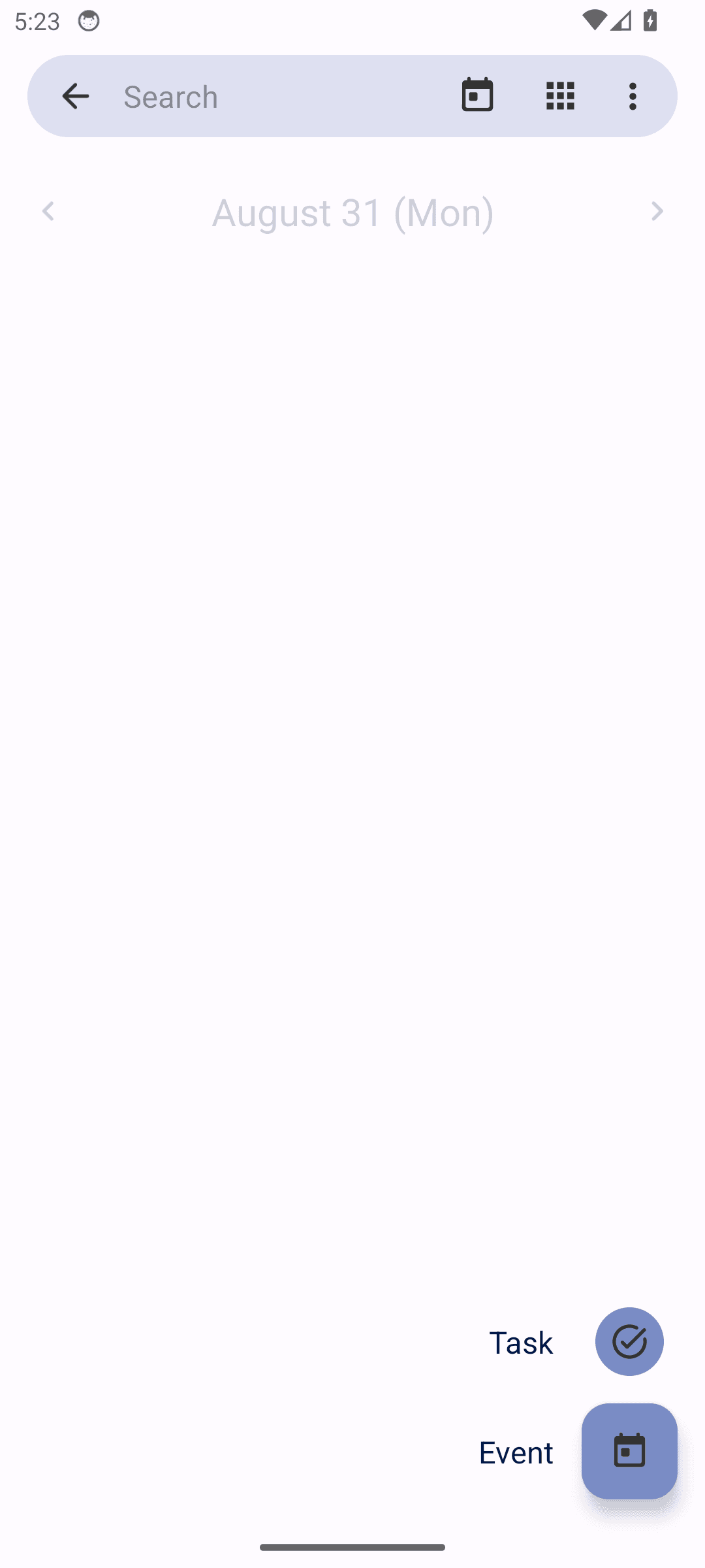
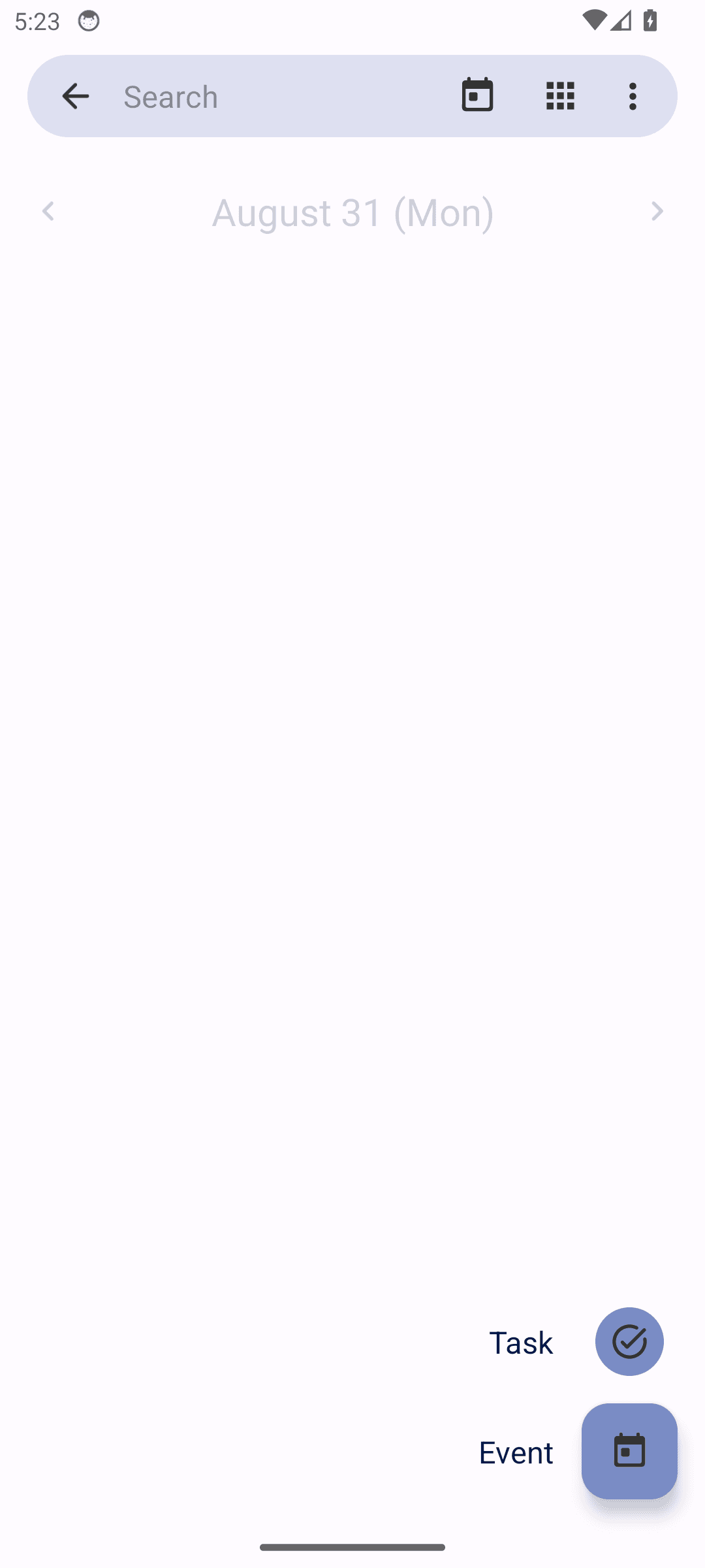
Accessibility · warning

Controls a screen reader cannot announce

Controls have nothing for a screen reader to announce. A blind user hears "button" with no indication of what it does, so the screen cannot be operated without sight.

Fossify Calendar: Controls a screen reader cannot announce

1 clickable control(s) on this screen have no visible text or accessibility label. Examples: org.fossify.calendar:id/fab_task_icon.

Measured against. WCAG 2.2 SC 1.1.1 Non-text Content and SC 4.1.2 Name, Role, Value
Accessibility · warning

Controls are too small to tap reliably

Controls are too small to hit reliably. People with larger fingers, limited dexterity, or a moving bus mistap them, and each mistap is either a wrong action or a retry.

Fossify Calendar: Controls are too small to tap reliably

3 interactive element(s) on this screen fall below Android's 48x48dp touch target guidance. Examples: Task, org.fossify.calendar:id/fab_task_icon, Event.

Measured against. Android accessibility guideline – 48x48dp minimum touch target (WCAG 2.2 SC 2.5.8, Target Size)

org.fossify.messages · version 2026-04-19_20

Fossify Messages

2 findings published.

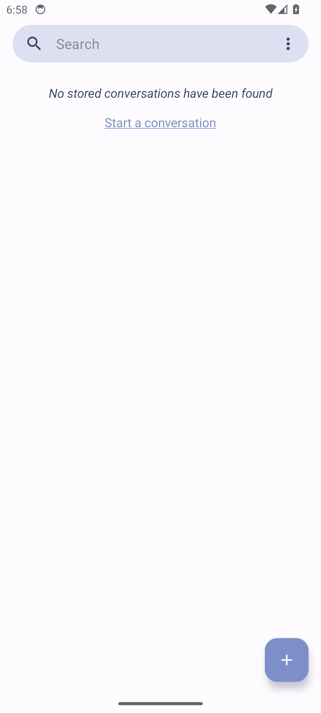
Accessibility · warning

Controls a screen reader cannot announce

Controls have nothing for a screen reader to announce. A blind user hears "button" with no indication of what it does, so the screen cannot be operated without sight.

Fossify Messages: Controls a screen reader cannot announce

1 clickable control(s) on this screen have no visible text or accessibility label. Examples: org.fossify.messages:id/conversations_fa.

Measured against. WCAG 2.2 SC 1.1.1 Non-text Content and SC 4.1.2 Name, Role, Value
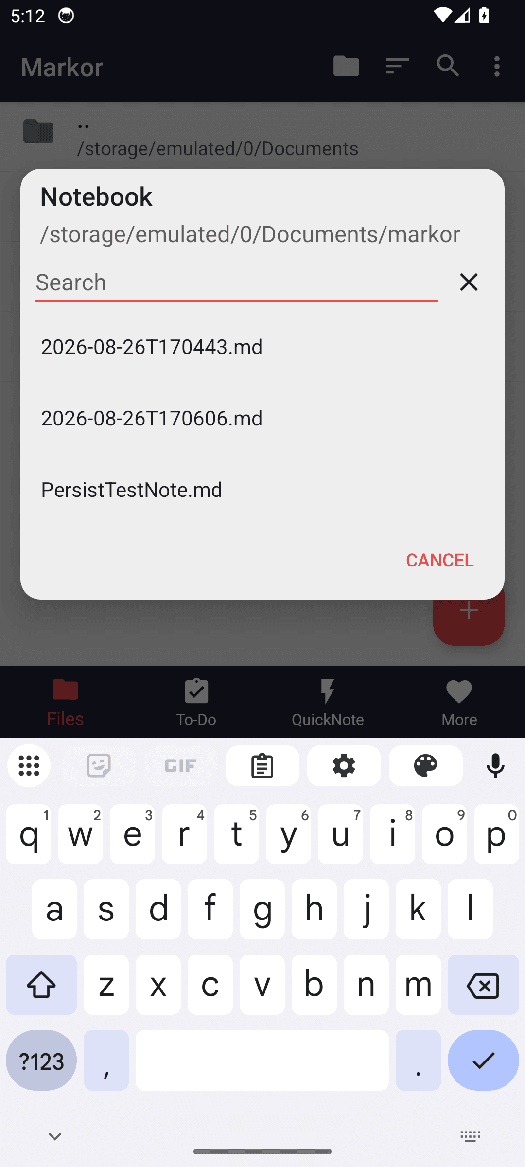
Accessibility · warning

Controls are too small to tap reliably

Controls are too small to hit reliably. People with larger fingers, limited dexterity, or a moving bus mistap them, and each mistap is either a wrong action or a retry.

Fossify Messages: Controls are too small to tap reliably

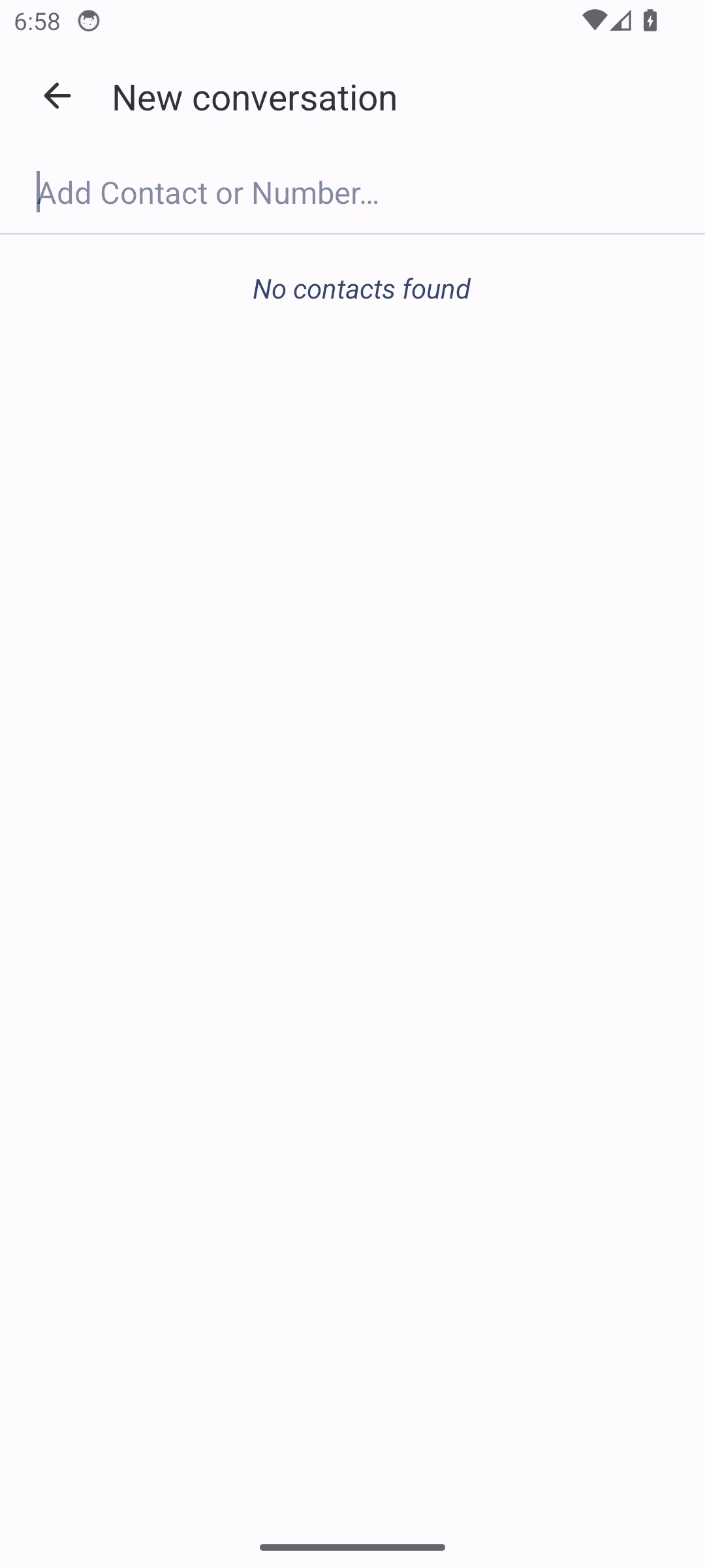
1 interactive element(s) on this screen fall below Android's 48x48dp touch target guidance. Examples: org.fossify.messages:id/contacts_letter_.

Measured against. Android accessibility guideline – 48x48dp minimum touch target (WCAG 2.2 SC 2.5.8, Target Size)

me.zhanghai.android.files · version 2026-04-19

Material Files

2 findings published.

Accessibility · warning

Controls a screen reader cannot announce

Controls have nothing for a screen reader to announce. A blind user hears "button" with no indication of what it does, so the screen cannot be operated without sight.

Material Files: Controls a screen reader cannot announce

24 clickable control(s) on this screen have no visible text or accessibility label. Examples: me.zhanghai.android.files:id/iconLayout, me.zhanghai.android.files:id/iconLayout, me.zhanghai.android.files:id/menuButton.

Measured against. WCAG 2.2 SC 1.1.1 Non-text Content and SC 4.1.2 Name, Role, Value
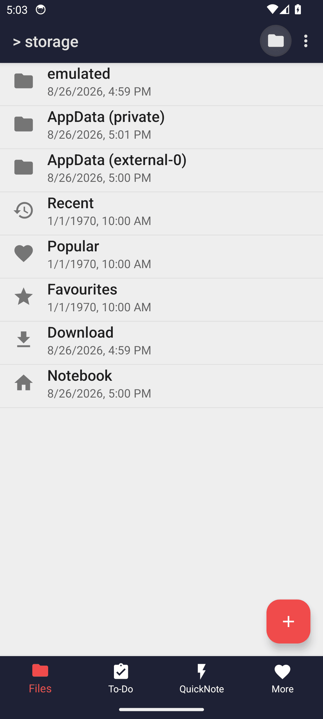
Accessibility · suggestion

Controls are too small to tap reliably

Controls are too small to hit reliably. People with larger fingers, limited dexterity, or a moving bus mistap them, and each mistap is either a wrong action or a retry.

Material Files: Controls are too small to tap reliably

1 interactive element(s) on this screen fall below Android's 48x48dp touch target guidance. Examples: More options.

Measured against. Android accessibility guideline – 48x48dp minimum touch target (WCAG 2.2 SC 2.5.8, Target Size)

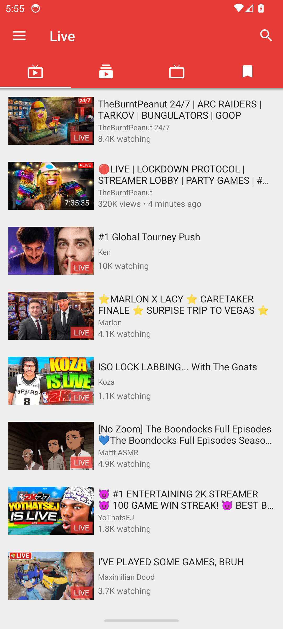
org.schabi.newpipe · version 2026-04-19_1010

Newpipe

2 findings published.

Accessibility · warning

Controls a screen reader cannot announce

Controls have nothing for a screen reader to announce. A blind user hears "button" with no indication of what it does, so the screen cannot be operated without sight.

Newpipe: Controls a screen reader cannot announce

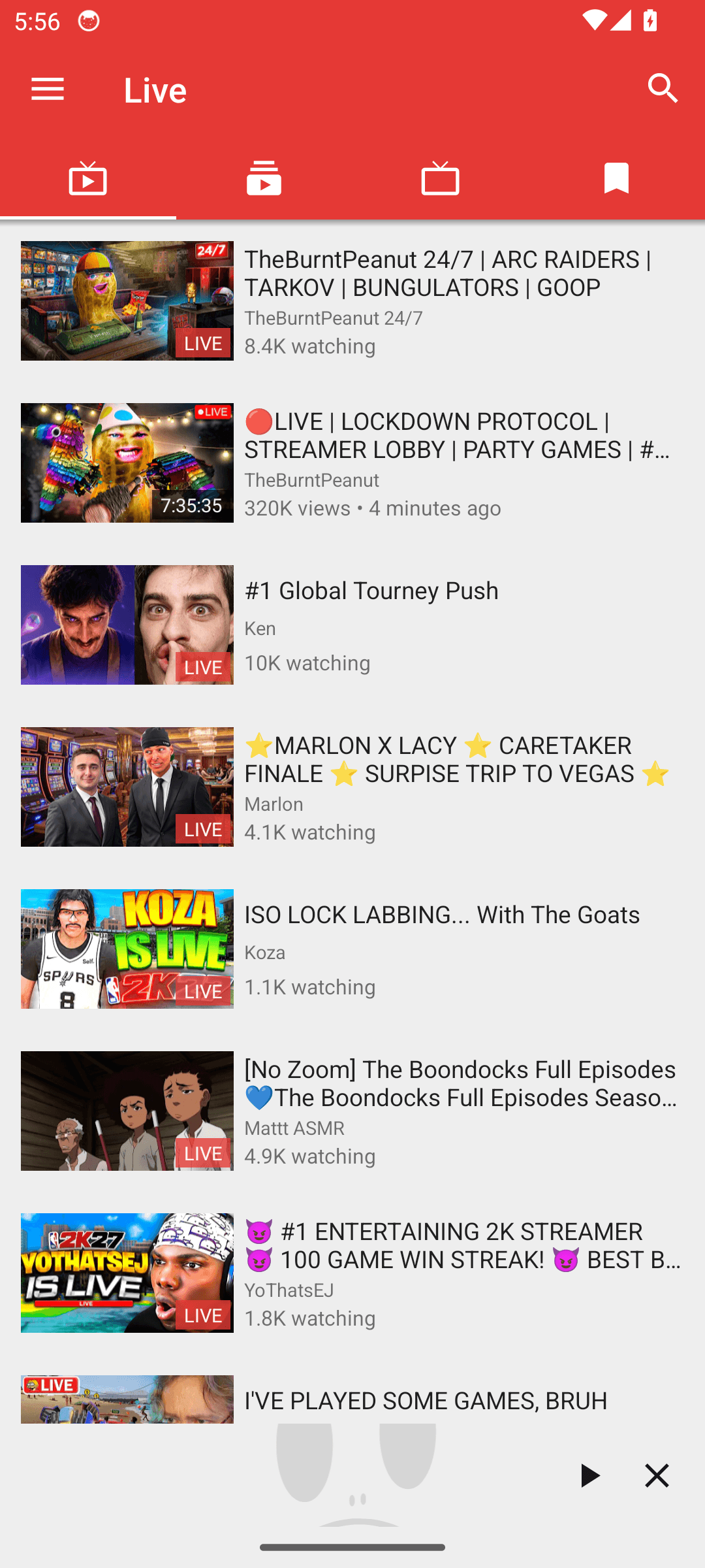
1 clickable control(s) on this screen have no visible text or accessibility label. Examples: org.schabi.newpipe:id/overlay_thumbnail.

Measured against. WCAG 2.2 SC 1.1.1 Non-text Content and SC 4.1.2 Name, Role, Value
Accessibility · warning

Controls are too small to tap reliably

Controls are too small to hit reliably. People with larger fingers, limited dexterity, or a moving bus mistap them, and each mistap is either a wrong action or a retry.

Newpipe: Controls are too small to tap reliably

1 interactive element(s) on this screen fall below Android's 48x48dp touch target guidance. Examples: org.schabi.newpipe:id/itemRoot.

Measured against. Android accessibility guideline – 48x48dp minimum touch target (WCAG 2.2 SC 2.5.8, Target Size)

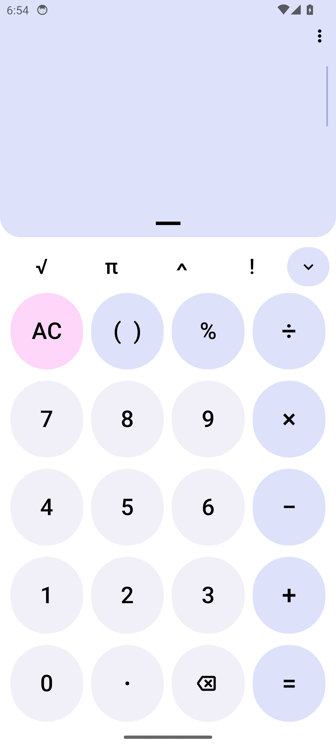
com.darkempire78.opencalculator · version 2026-04-19_53

Opencalculator

2 findings published.

Accessibility · warning

Controls a screen reader cannot announce

Controls have nothing for a screen reader to announce. A blind user hears "button" with no indication of what it does, so the screen cannot be operated without sight.

Opencalculator: Controls a screen reader cannot announce

1 clickable control(s) on this screen have no visible text or accessibility label. Examples: com.darkempire78.opencalculator:id/menuB.

Measured against. WCAG 2.2 SC 1.1.1 Non-text Content and SC 4.1.2 Name, Role, Value
Accessibility · warning

Controls are too small to tap reliably

Controls are too small to hit reliably. People with larger fingers, limited dexterity, or a moving bus mistap them, and each mistap is either a wrong action or a retry.

Opencalculator: Controls are too small to tap reliably

3 interactive element(s) on this screen fall below Android's 48x48dp touch target guidance. Examples: com.darkempire78.opencalculator:id/menuB, com.darkempire78.opencalculator:id/const, com.darkempire78.opencalculator:id/histo.

Measured against. Android accessibility guideline – 48x48dp minimum touch target (WCAG 2.2 SC 2.5.8, Target Size)

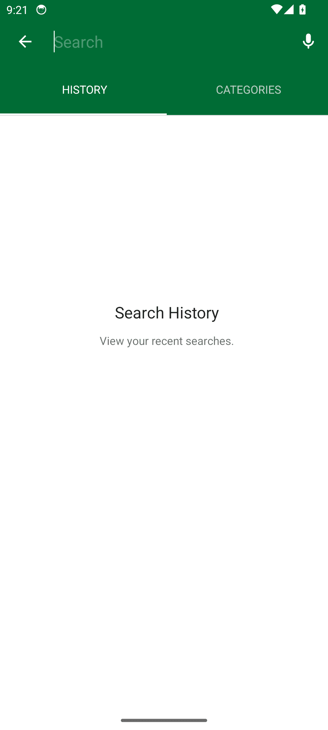
app.organicmaps · version 2026-04-19_26040708

Organic Maps

2 findings published.

Accessibility · warning

Controls a screen reader cannot announce

Controls have nothing for a screen reader to announce. A blind user hears "button" with no indication of what it does, so the screen cannot be operated without sight.

Organic Maps: Controls a screen reader cannot announce

1 clickable control(s) on this screen have no visible text or accessibility label. Examples: app.organicmaps:id/voice_input.

Measured against. WCAG 2.2 SC 1.1.1 Non-text Content and SC 4.1.2 Name, Role, Value
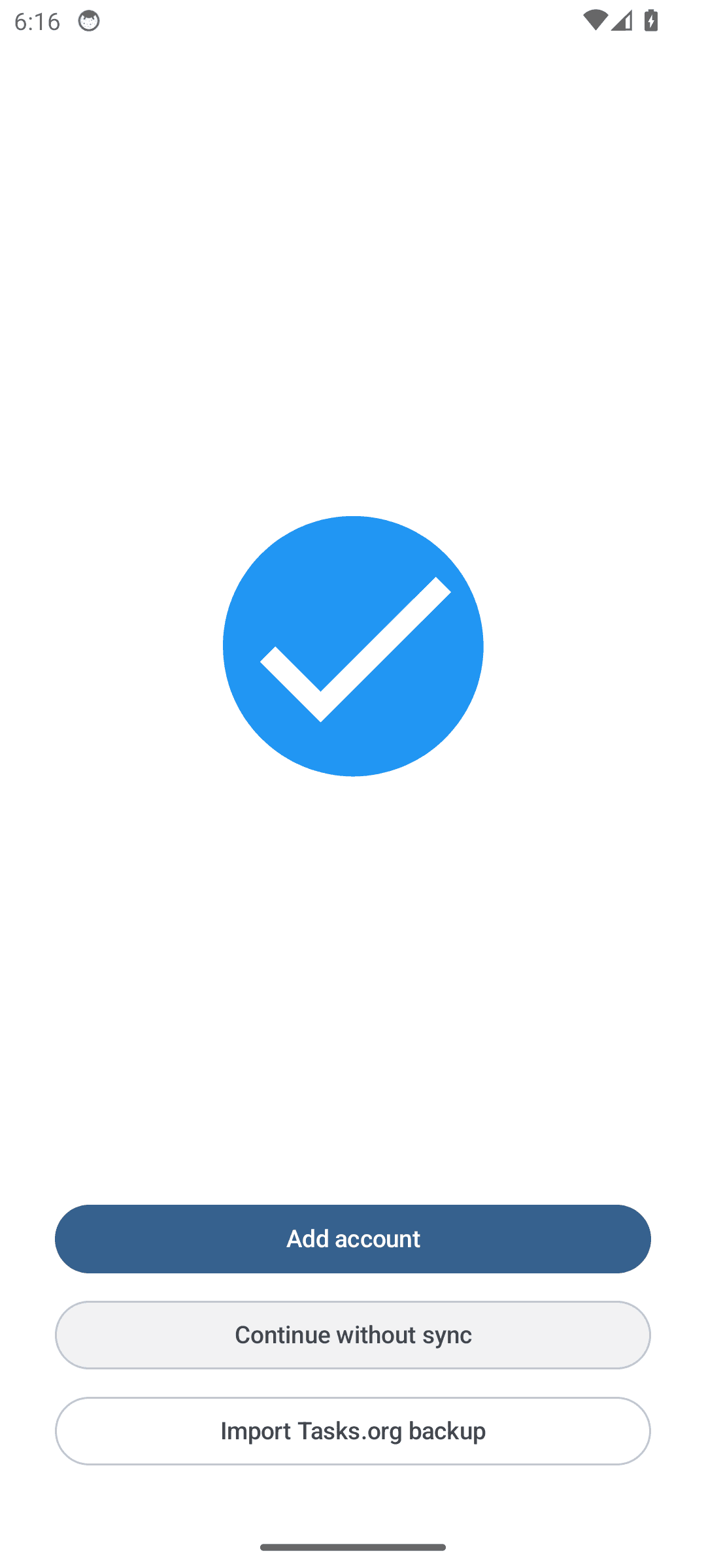
Accessibility · warning

Controls are too small to tap reliably

Controls are too small to hit reliably. People with larger fingers, limited dexterity, or a moving bus mistap them, and each mistap is either a wrong action or a retry.

Organic Maps: Controls are too small to tap reliably

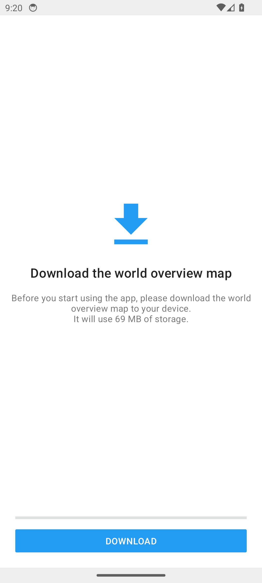
1 interactive element(s) on this screen fall below Android's 48x48dp touch target guidance. Examples: DOWNLOAD.

Measured against. Android accessibility guideline – 48x48dp minimum touch target (WCAG 2.2 SC 2.5.8, Target Size)

org.catrobat.paintroid · version 2.10.0

Pocketpaint

2 findings published.

Accessibility · warning

Controls a screen reader cannot announce

Controls have nothing for a screen reader to announce. A blind user hears "button" with no indication of what it does, so the screen cannot be operated without sight.

Pocketpaint: Controls a screen reader cannot announce

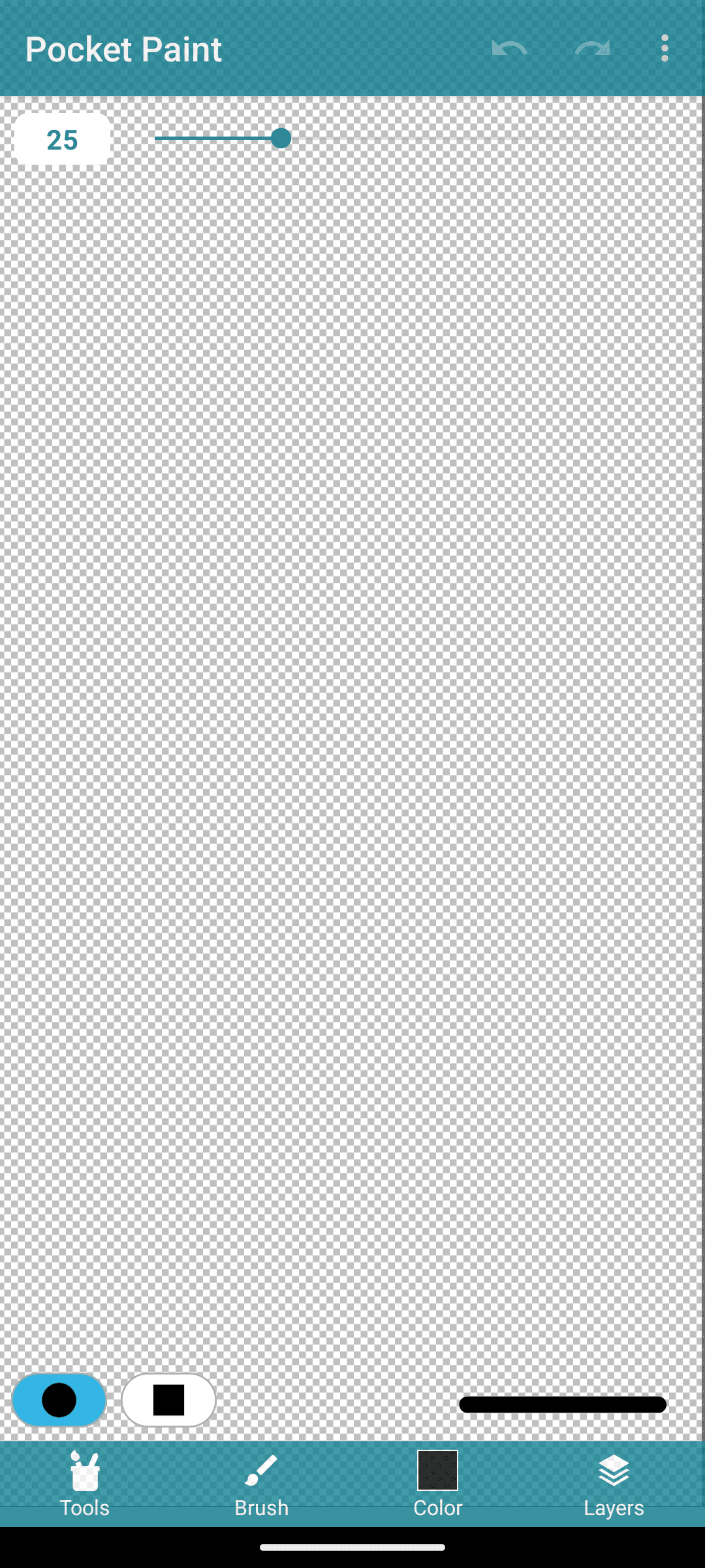
2 clickable control(s) on this screen have no visible text or accessibility label. Examples: org.catrobat.paintroid:id/pocketpaint_st, org.catrobat.paintroid:id/pocketpaint_st.

Measured against. WCAG 2.2 SC 1.1.1 Non-text Content and SC 4.1.2 Name, Role, Value

Accessibility · suggestion

Controls are too small to tap reliably

Controls are too small to hit reliably. People with larger fingers, limited dexterity, or a moving bus mistap them, and each mistap is either a wrong action or a retry.

Pocketpaint: Controls are too small to tap reliably

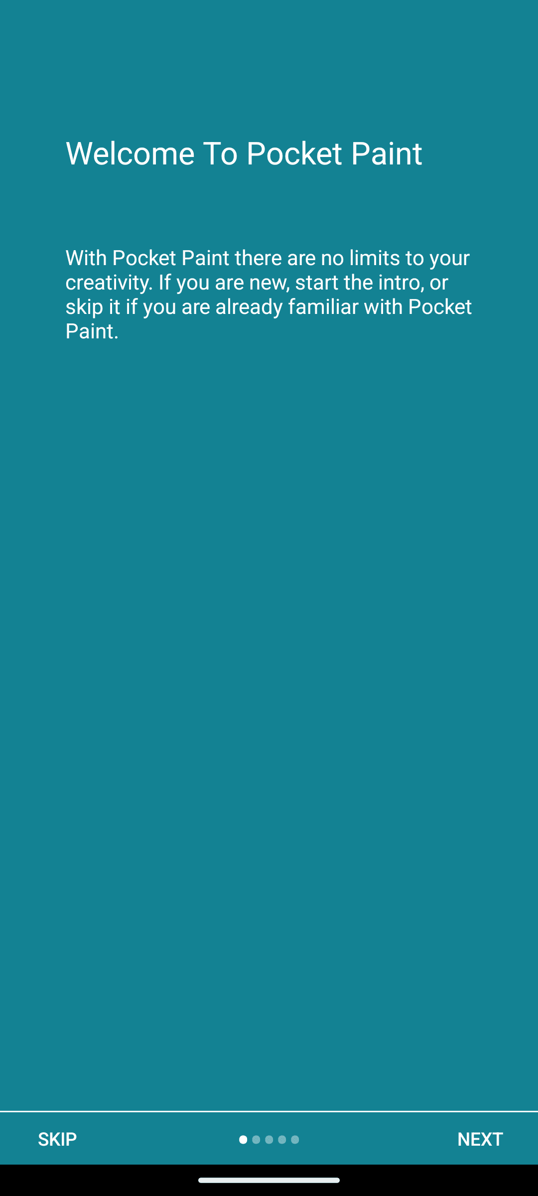
2 interactive element(s) on this screen fall below Android's 48x48dp touch target guidance. Examples: SKIP, NEXT.

Measured against. Android accessibility guideline – 48x48dp minimum touch target (WCAG 2.2 SC 2.5.8, Target Size)

org.secuso.privacyfriendlynotes · version 2.1.1

Privacy_Friendly_Notes

2 findings published.

Accessibility · warning

Controls a screen reader cannot announce

Controls have nothing for a screen reader to announce. A blind user hears "button" with no indication of what it does, so the screen cannot be operated without sight.

Privacy_Friendly_Notes: Controls a screen reader cannot announce

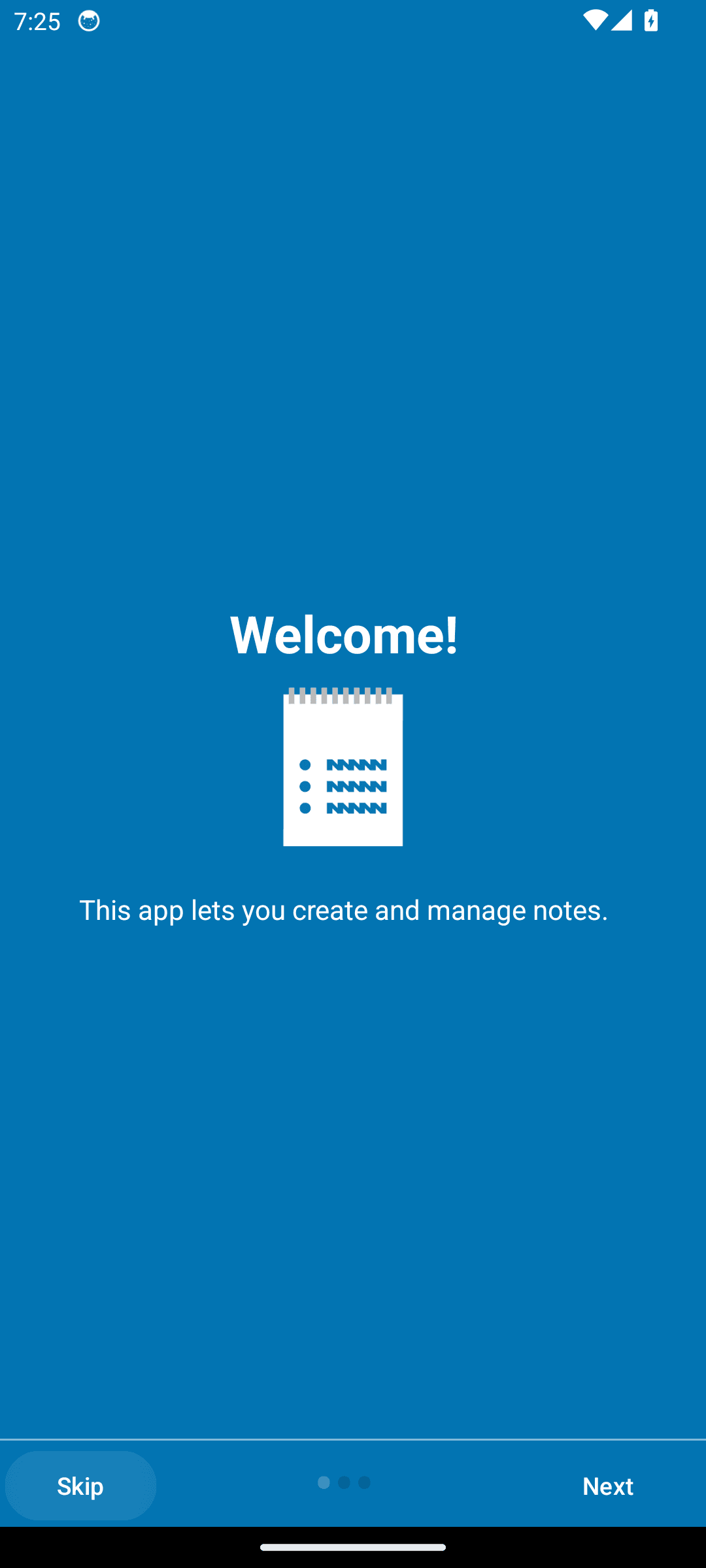
1 clickable control(s) on this screen have no visible text or accessibility label. Examples: image.

Measured against. WCAG 2.2 SC 1.1.1 Non-text Content and SC 4.1.2 Name, Role, Value

Accessibility · warning

Controls are too small to tap reliably

Controls are too small to hit reliably. People with larger fingers, limited dexterity, or a moving bus mistap them, and each mistap is either a wrong action or a retry.

Privacy_Friendly_Notes: Controls are too small to tap reliably

2 interactive element(s) on this screen fall below Android's 48x48dp touch target guidance. Examples: image, org.secuso.privacyfriendlynotes:id/searc.

Measured against. Android accessibility guideline – 48x48dp minimum touch target (WCAG 2.2 SC 2.5.8, Target Size)

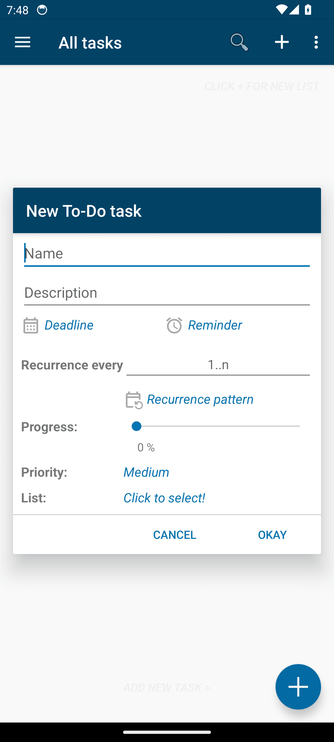
org.secuso.privacyfriendlytodolist · version 3.4.0

Privacy_Friendly_Todolist

2 findings published.

Accessibility · warning

Controls a screen reader cannot announce

Controls have nothing for a screen reader to announce. A blind user hears "button" with no indication of what it does, so the screen cannot be operated without sight.

Privacy_Friendly_Todolist: Controls a screen reader cannot announce

1 clickable control(s) on this screen have no visible text or accessibility label. Examples: org.secuso.privacyfriendlytodolist:id/cb.

Measured against. WCAG 2.2 SC 1.1.1 Non-text Content and SC 4.1.2 Name, Role, Value
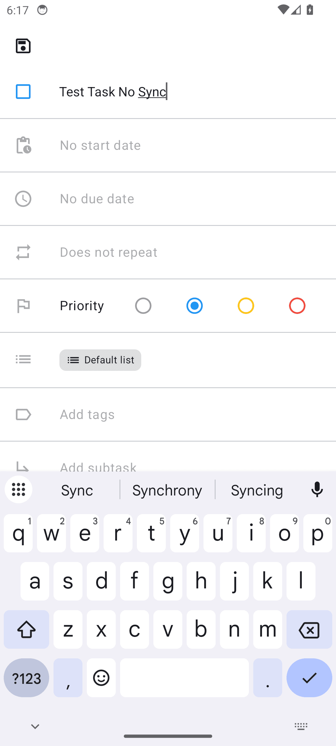
Accessibility · warning

Controls are too small to tap reliably

Controls are too small to hit reliably. People with larger fingers, limited dexterity, or a moving bus mistap them, and each mistap is either a wrong action or a retry.

Privacy_Friendly_Todolist: Controls are too small to tap reliably

4 interactive element(s) on this screen fall below Android's 48x48dp touch target guidance. Examples: Deadline, Reminder, 1..n.

Measured against. Android accessibility guideline – 48x48dp minimum touch target (WCAG 2.2 SC 2.5.8, Target Size)

de.danoeh.antennapod · version 2026-04-19

Antennapod

1 finding published.

Accessibility · suggestion

Controls are too small to tap reliably

Controls are too small to hit reliably. People with larger fingers, limited dexterity, or a moving bus mistap them, and each mistap is either a wrong action or a retry.

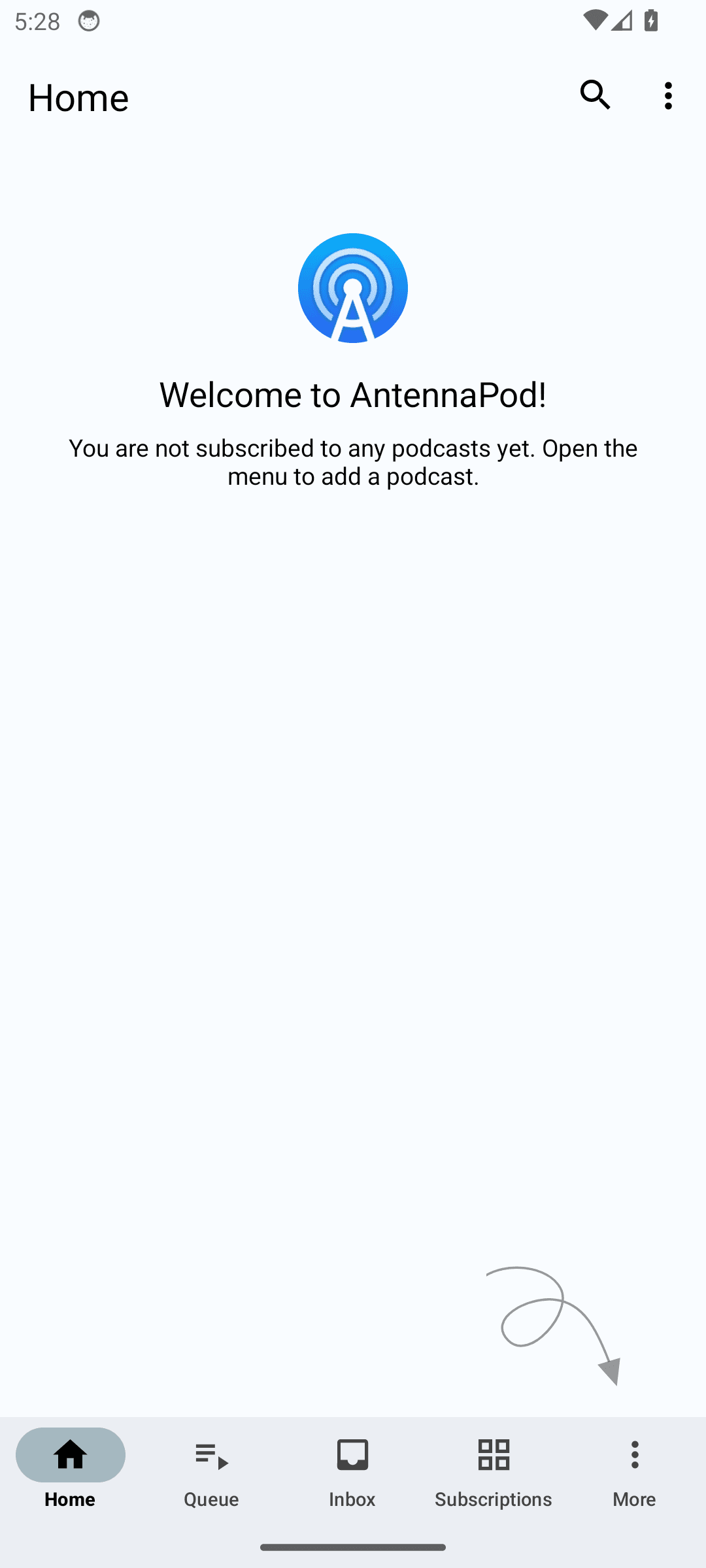
Antennapod: Controls are too small to tap reliably

1 interactive element(s) on this screen fall below Android's 48x48dp touch target guidance. Examples: More options.

Measured against. Android accessibility guideline – 48x48dp minimum touch target (WCAG 2.2 SC 2.5.8, Target Size)

org.breezyweather · version 2026-04-19

Breezy Weather

1 finding published.

Accessibility · suggestion

Controls are too small to tap reliably

Controls are too small to hit reliably. People with larger fingers, limited dexterity, or a moving bus mistap them, and each mistap is either a wrong action or a retry.

Breezy Weather: Controls are too small to tap reliably

1 interactive element(s) on this screen fall below Android's 48x48dp touch target guidance. Examples: Tap to drag the list items to sort.

Measured against. Android accessibility guideline – 48x48dp minimum touch target (WCAG 2.2 SC 2.5.8, Target Size)

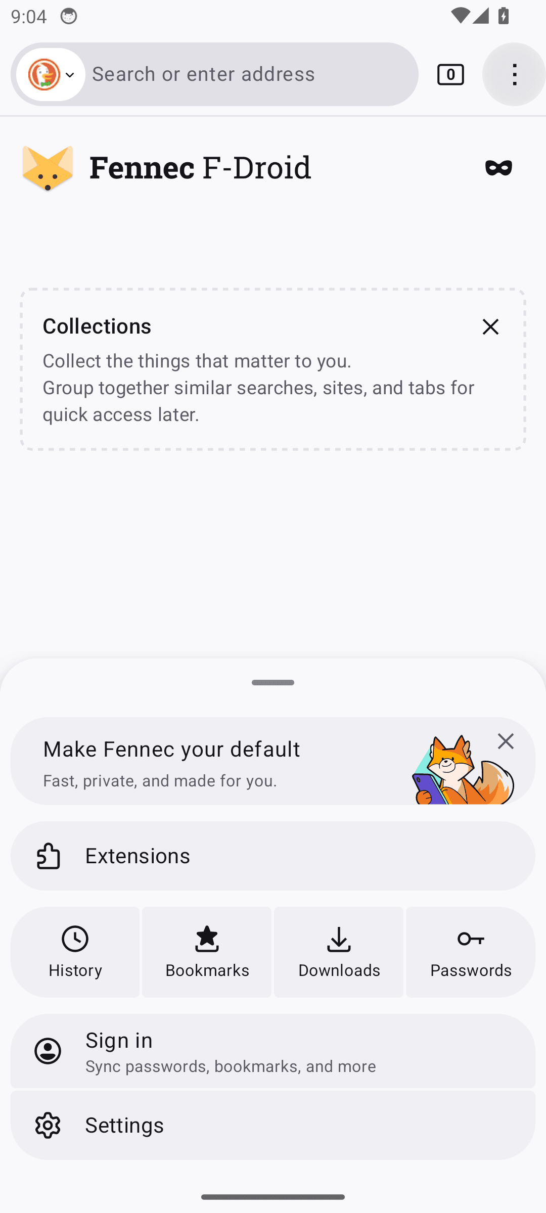
org.mozilla.fennec_fdroid · version 142.0.1

Fennec

1 finding published.

Accessibility · warning

Controls are too small to tap reliably

Controls are too small to hit reliably. People with larger fingers, limited dexterity, or a moving bus mistap them, and each mistap is either a wrong action or a retry.

Fennec: Controls are too small to tap reliably

1 interactive element(s) on this screen fall below Android's 48x48dp touch target guidance. Examples: Close menu.

Measured against. Android accessibility guideline – 48x48dp minimum touch target (WCAG 2.2 SC 2.5.8, Target Size)

org.fossify.notes · version 2026-04-19_13

Fossify Notes

1 finding published.

Accessibility · suggestion

Controls are too small to tap reliably

Controls are too small to hit reliably. People with larger fingers, limited dexterity, or a moving bus mistap them, and each mistap is either a wrong action or a retry.

Fossify Notes: Controls are too small to tap reliably

1 interactive element(s) on this screen fall below Android's 48x48dp touch target guidance. Examples: More options.

Measured against. Android accessibility guideline – 48x48dp minimum touch target (WCAG 2.2 SC 2.5.8, Target Size)

org.localsend.localsend_app · version 1.17.0

Localsend

1 finding published.

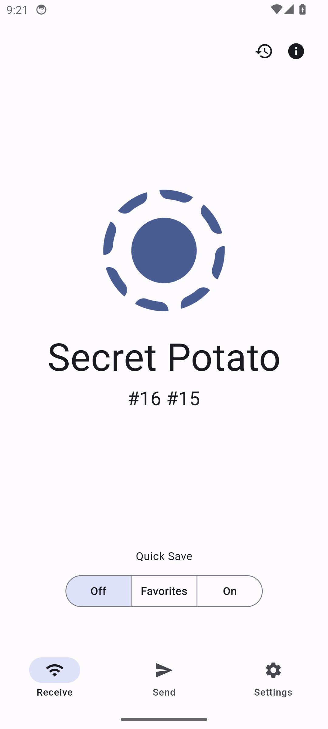
Usability · warning

Unusual double-number label under device name

Something on screen is drawn wrong rather than merely arranged awkwardly. People trust what an app shows them, so a wrong picture is believed.

Localsend: Unusual double-number label under device name

The subtitle under 'Secret Potato' reads '#16 #15', which appears to be two separate identifiers concatenated together. This looks like a rendering or data bug rather than intentional text.

Suggested fix. Verify the intended format for this identifier; if it should be a single ID, fix the string concatenation logic.

Confirmed on a device. Re-checked on live hardware, on the same build. Reproduced on a fresh install with a different device name; "#16 #15" = last octet of each interface IP (wlan0 10.0.2.16, eth0 10.0.2.15).

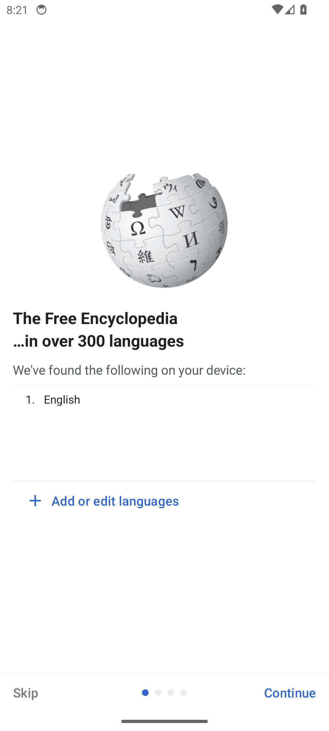
org.wikipedia · version 2026-04-19_50579

Wikipedia

1 finding published.

Accessibility · warning

Controls a screen reader cannot announce

Controls have nothing for a screen reader to announce. A blind user hears "button" with no indication of what it does, so the screen cannot be operated without sight.

Wikipedia: Controls a screen reader cannot announce

3 clickable control(s) on this screen have no visible text or accessibility label. Examples: container, container, container.

Measured against. WCAG 2.2 SC 1.1.1 Non-text Content and SC 4.1.2 Name, Role, Value
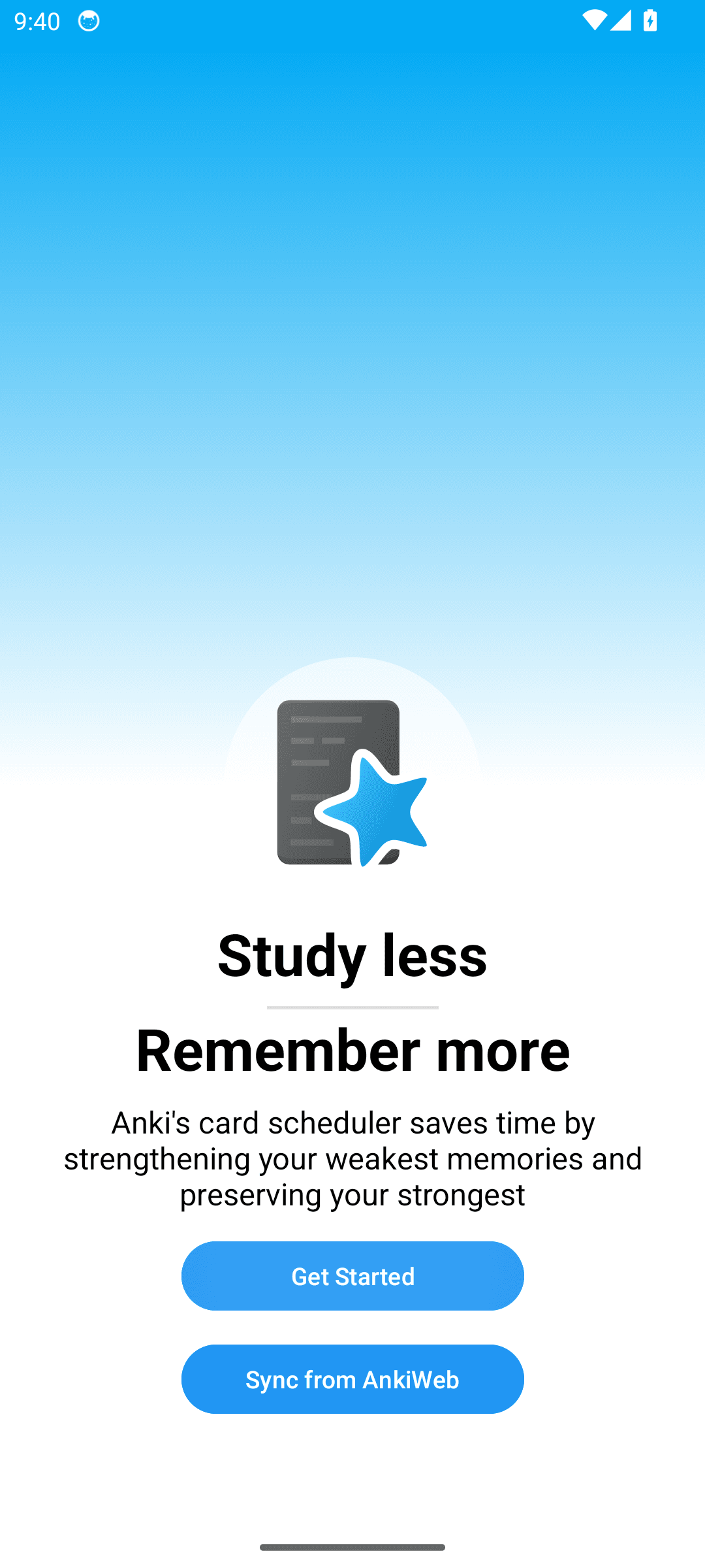
Confirmed on a device. Re-checked on live hardware, on the same build. Exactly 3 unlabelled clickables (16x48dp) - count matches the claim.
These are other people’s apps.

Nothing here was reported to a maintainer as a defect on our say-so, and nothing here is a judgement about the quality of the projects that wrote it. They are published because a review that only shows the bugs it planted for itself is not a review.